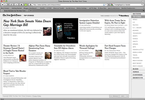
A couple of hours ago the New York Times launched an update of the skimmer interface I wrote about earlier this year. It’s an alternative way to browser their online magazine. They call it The Times Skimmer. The new interface let’s you navigate between different sections of their paper by only using the arrows on your keyboard. The GUI also lets you switch fast between articles and once you’re done reading one you can easily move on to the next.

Times Skimmer features the following seven display options:
- Stories displayed in a grid
- Content displayed based on editorial ranked feeds
- Headlines displayed in a list
- Content presented in the classic typeface Helvetica
- Content displayed against a black background
- Headlines and brief summaries displayed in a wrap-around format
- Headlines, bylines and brief summaries displayed in a design similar to word magnets for refrigerators
After I’ve been spending a couple of minutes with this updated interface I’m struck by what now seems obvious. Isn’t this interface perfectly adapted to be read of a 16:9 touch screen. Of course it resizes as you scale your browser, but that only means it will support a rotation.

Is The New York Times preparing for an Apple Tablet or maybe a reading device of their own?
Every time Apple has launched a new gadget they’ve made sure they gained some support by a selection of leading brands already tuned into their new shit. Well, in that case – could the Skimmer interface from The Times be exactly such a partner. If so…will we finally see an Apple Tablet in the near future?
Well. I’m sure about one thing. I’ll get my hands on one asap!
Update!
It seems more mags than The Times are preparing. I spotted this one this morning yesterday on YouTube. It’s Sports Illustrated’s version of a tablet prepared digital mag.