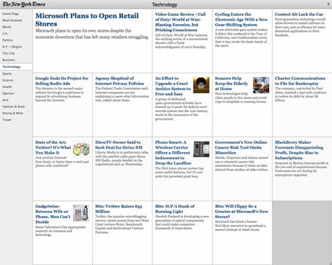
Yesterday ReadWriteWeb reported on a new article skimmer interface over at New York Times. It’s a stunning new way to let you quick read the headlines of all the latest news from the Sunday Times. The simplicity of this thing is striking yet genius.

And as often before it turns out that content, usability and simplicity beats smart, strange and unique solutions online. Just have a look at Craiglists, the mother of simplicity.
Navigating on a website is merely a road to our goal ›› the content. By creating an interface that consist of a number of boxes that contain a small image, headline and an intro text, this new prototype makes it very easy for me to come back and browse the latest news in all categories. It doesn’t take me more than a couple of minutes until I’ve browsed the first page and another 16 sections.
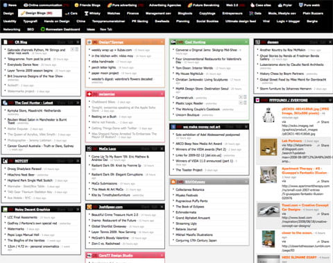
The navigational experience is very close to my personal favorite RSS tool Netvibes. I bring all the feeds I want to read into my Netvibes account and then it doesn’t take me long to browse through the latest news online.

One of Johan Ronnestams Netvibes tabs.
The great benefits with these kind of solution is the way everything is equally weighed in terms of size, colors and content. The eye races over the screen and we’re not far from the offline morning paper behavior when we skimmer the newspaper before actually reading it. This was of course something that the Times wanted to replicate. Once they launch this simple interface as an iPhone widget then I’ll be the first to start using it. Until then I’ll continue to read my favorite Times sections through Netvibes, basically the same except for that Netvibes is actually better since you can read the entire article without leaving the interface.
What should you do? Judge for yourselves.
New York Times reinvents online newspaper reading with a new skimmering interface
by
Tags: