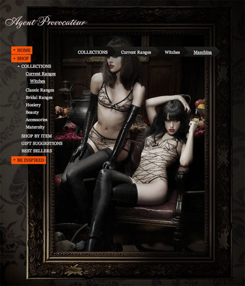
Let me make this clear from the beginning. It’s not the product that made me write about the shopping experience. But, I’ll admit that I found the shopping experience because of the product.
I’m a fan of usability. What doesn’t work…doesn’t work. However, I’m also a fan of dramatization and communication. This site by Agent Provocateur that I found through Adverblog has done a fine job of combining both. What strikes me already when you land on the first page of these fine Agents is the fact that you get a choice.

You’re not automatically thrown into a 10MB loader without knowing where you’re heading. I obviously clicked ‘Be Inspired’. If found myself being thrown into a fast loading interactive movie experience.  Apart from the movie experience, there’s only two other objects on the screen – a logo and a skull. As I mouse over the skull a link to Buy Me appears. Easy to find and since it’s the only choice away from the full screen experience I think most people will find their way into the store. Once there, they haven’t built a ordinary shopping experience for their latest collections. Instead you get to explore a wide screen photo montage. Once you click the ‘product’ of your choice you end up with a poster-like photo that also features the product information.

Agent Provocateur has always been innovators, like with the Kylie ad for example. The way they combine a campaign site with their online store is a great example of how you can create a rich online dramatized experience without loosing track of usability.
Agent Provocateur knows how to tease
by