Who is heading your brand? Does he or she have an understanding for all, and I mean all, steps in the consumer interaction with your brand.
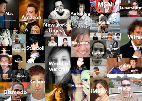
The new generation of consumers crave 4 things from their favorite brands. These 4 things was something we found in a global focus group study we did for one of the global brands I’ve worked with. Teens and youngsters between 15 and 25 years old were interviewed in leading style cities like New York, London, Rio de Janeiro, Paris, Stockholm, Bangkok, Hong Kong, Tokyo, Singapore, Beijing, Amsterdam, Berlin and even more cities that I cannot remember.
The 4 things were:
- Innovation
- Creative excellence
- Entertainment
- Interaction.
They crave it everywhere in every step of their contact with you brand.
Total integration equals success.
Hyper jump the process back and fourth
Most brands tend to start a brand platform project that ultimately leads to developing your brand first, then collateral’s, brand guidelines and finally they look at the products and services. New brands and super brands – they look at the brand heritage, what’s your story, where do you come from etc, but more important, where are they heading. Based on this knowledge they move over to the products and services and design these. The it’s time to move back to the rest.
You shouldn’t let a brand or brand guidebook lead your product development cause it’s usually stiff books filled with rules what NOT to do. When the first rule you have to learn about communication is WHAT rules can we brake!
Total integration demands total creativity
In order for your brand to achieve this level of integration that your target are asking for, you have to get a partner on board that can act as your creative style police through your entire process. The challenge for all modern brands is to stay in control or at least have someone from A to Z that make sure you do.
Let’s look at Apple.
Steve Jobs and his way of totally controlling Apple is probably the best example there is. What’s stunning with Apple is exactly the way they tend to value ever single step of consumer contacts as the most important part in the company. Nothing, and I mean nothing is left behind. Of course I don’t know their entire chain of customer contacts. But let’s look at one possible chain and how they’ve designed it.
My name is Bill. I’m looking for a new computer and I’ve heard about Apple. This might be my road from a non believer to a brand fanatic.
1. Traditional advertising
TV commercials
Apple vs PC has become an icon in the US when it comes to harass your competitors in open public. Apart from that it’s totally on brand in terms of tone of voice and simplicity.
Print
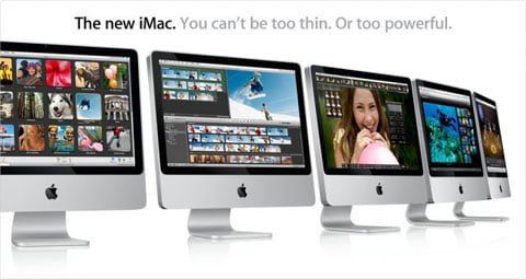
With the strong products Apple has, there’s usually no need to create a story beyond your own brand values and product. This is the ultimate example why communication and creativity should be a very integrated part of engineering. Most technology companies develop technology first and then comes the packaging and design. Apple integrates the two and on top of that, would never develop anything without having communication experts involved in the process.
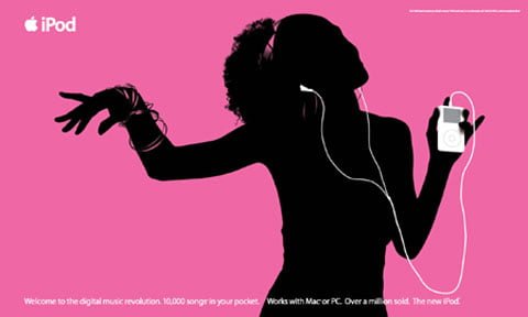
With iTunes it’s different. This product is available on both Mac and PC.
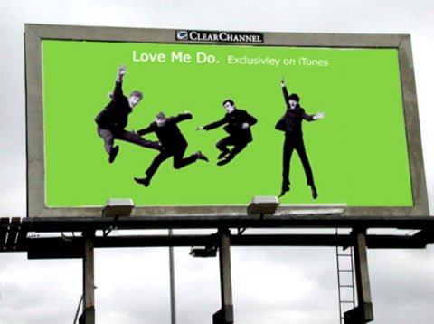
You can also use iTunes to shop for new music even if you end up playing it on a another Mp3 player. This requires a different strategy.
2. PR & Events

No one can have missed the fact that the Apple company is quiet as a mouse. A couple times a year, Steve Jobs launches Apples latest products during the Mac World. The keynote he delivers on those days are followed by millions. Every day between is filled with rumors and ideas on what the next Mac World will bring. A great PR strategy that doesn’t only keep interest up but also keeps prices from falling. Due to the illness of Steve Jobs the future of the Macworld seems uncertain though.
3. Photography
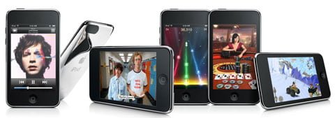
Where ever I see an Apple product I’m stunned with the quality and ingenuity of the photography. Look at this image above – the balance and the creativity with a yet simple set up. That mirror effect that points towards the next lying down iTouch is just fabulous.
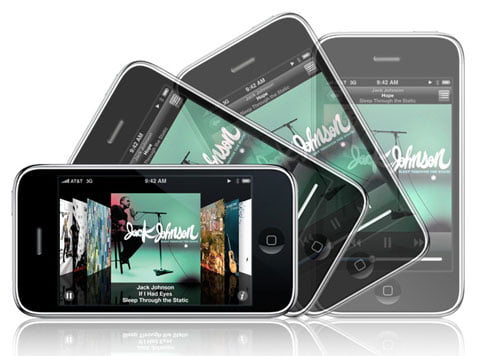
You seldom see a photo from Apple that doesn’t both show the product and communicate a functionality or a USP.
4. Online banners
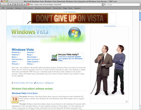
Yet another area where Apple innovates.
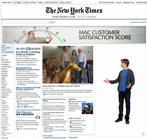
These banners is not about teasing you to click instead Apple brings the humor from the TVC into banners in a very clever way.
5. Online campaign site
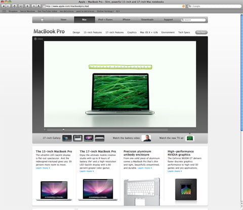
Why would you do a campaign site when you can turn your entire website into an emotional experience. I’d say Apples section where they talk about partners and other people who use their products serves as a great campaign area.
6. Partnerships

What do we love more than a great brand? Answer = Two great brands! Nike+ is the perfect example of this. It drives sales for both Apple and Nike but above all contributes to positioning them both as cool innovators.
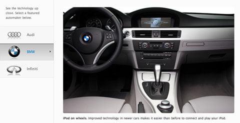
Leading car brands all over the worlds has implemented support for the iPod in their latest car models. In this case I’m sure it benefits them more than Apple.
7. Website
The Apple website is definitely one of the best corporate websites in the world. It’s user friendly, well designed, great functionality, no loading times, non CMS templated design and on brand.
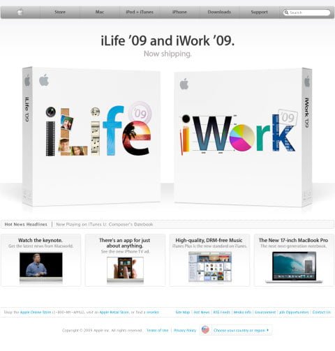
I just love how they’ve first and foremost have developed their site based on what consumers want and need.
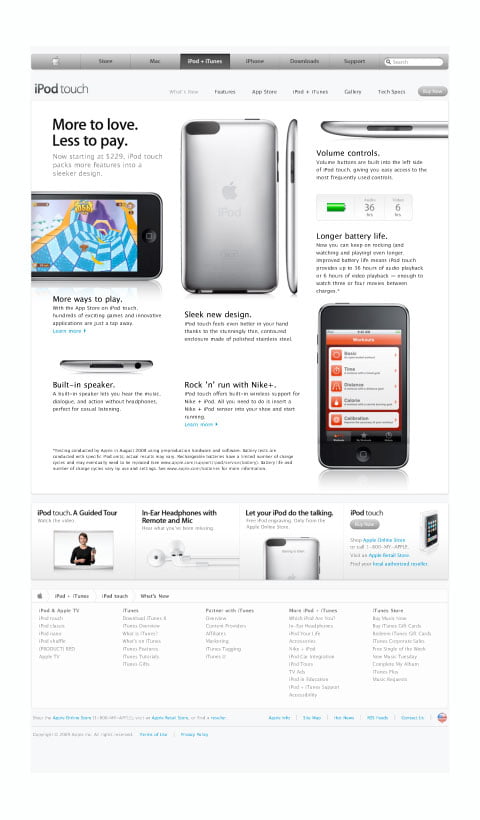
Many of the pages looks more like a very nice printed magazine than a website.
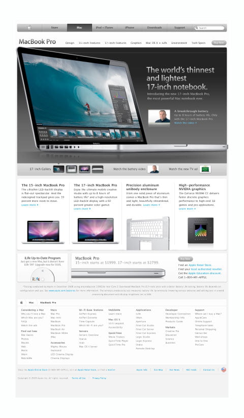
This proves that someone at Apple understood that websites are not supposed to be built based on the specs of a content management system but instead the specs of your customer needs.
8. On- and offline store
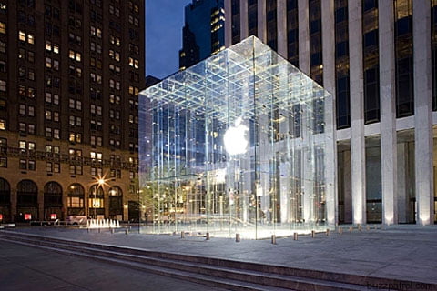
Apple knows how to create a brand drama. Their latest store on Manhattan shows Apple never rests. And if you continue to look at more of their stores they’re continuously updating themselves. I wrote last year about the London experience.
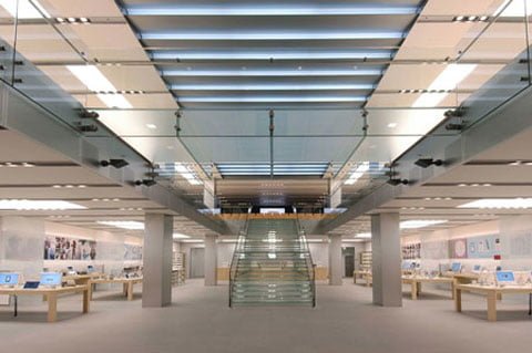
The actual shopping experience is something else. I wrote about that a long time ago so I won’t repeat myself. But it’s like nothing else, I’ll promise you that.

When it comes to the online shopping experience. The Apple.com site is nicely integrated with their online store.
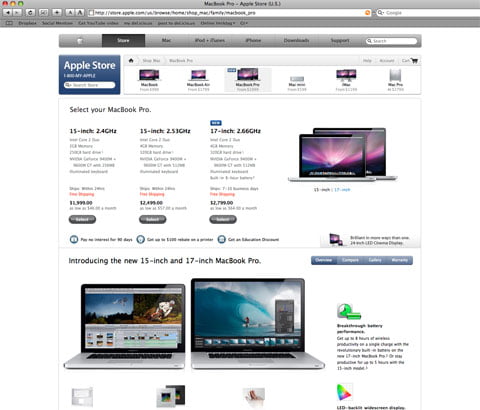
Once in the store, it’s all about usability and effectivness – just as it should be.
9. Packaging
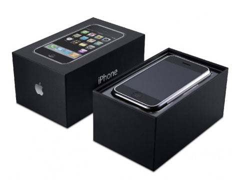
I’ve bought quite many Apple products and every time I open the package it’s an experience. No brand, and I mean NO brand has the consistency Apple has had in innovating how they package their product.

What’s stunning is also the fact that lots of stuff inside that box you’re opening is directly integrated with software interfaces and computer materials. The experience to use a mac starts with carrying home the package.
10. Product
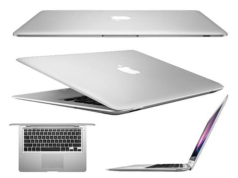
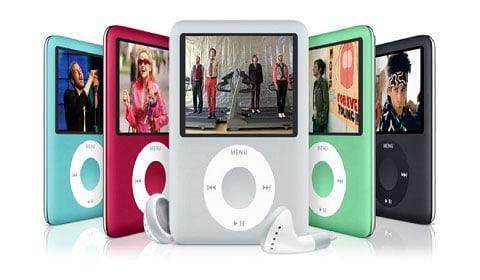
Do I need to say anything?
11. Inside the actual product
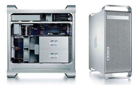
If you get your hands on a Mac that needs to be opened for any reason. Take the opportunity and do so. Cause these guys know that reputation starts from everywhere in the consumer chain – including the 0.1% who ever open a computer. Inside it’s incredible well designed and the G5 is even backlit inside!
12. Operative system
Awarded design. Usability is better than everything else on the market. It’s faster and yet more stabile and works both for Mac or PC.
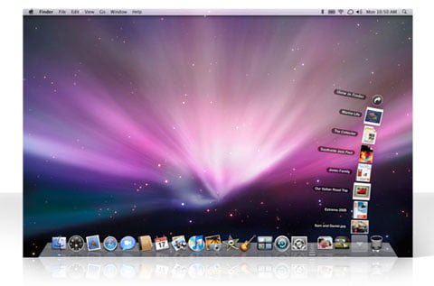
The number of innovative solutions in the way you interact with software and the operative system are amazing.
13. Product & software interface
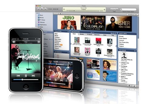
The total integration between softwares and the interface is great. But what’s even cooler is that some of the latest products like iWork even stretches outside the actual software.
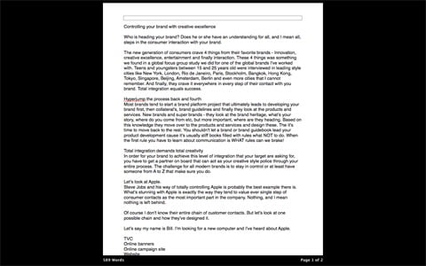
iWork for example has a full screen editing mode where it actually seems like the latest Macbook Pro has been redesign to be integrated with that functionality.
14. Support
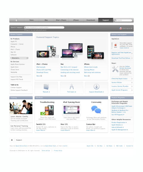
Crowd sourcing, find whatever you need, integration into every computer and software. Awarded – yes.
To sum up. The reason behind Apple success is of course innovation first and foremost. Without brains like Steve Jobs on board the company would be jack shit. But without Steve’s way of leading the brand – bringing on people like Lee Clow and more of the best creative brains in the industry, having them helping him controlling every bit of the brand from first contact to final kill – is the key to success.
Mike Loop with Apple says it best:
The core dilemma for talented designers in any field is this: If you strive for greatness in your design, you will meet resistance; if you strive to avoid resistance, you can’t do great design. Different is scary. Great design has to fight with the idea that many see “better” as meaning “more of the same”. The better your work and the higher your standards, the more you’ll have to fight against the urge to stay within the warm, safe confines of mediocrity.
Are you ready? Be prepared, cause you’ll step on a lot of toes. But the reward might be worth it cause you’ll end up with consumer like these.

A final word
Making a vision like this come alive means that a very small group has to control many steps. But on the other hand, being the best in the world has never been about doing as other people say, it’s always been about going your own way, towards your vision no matter what!