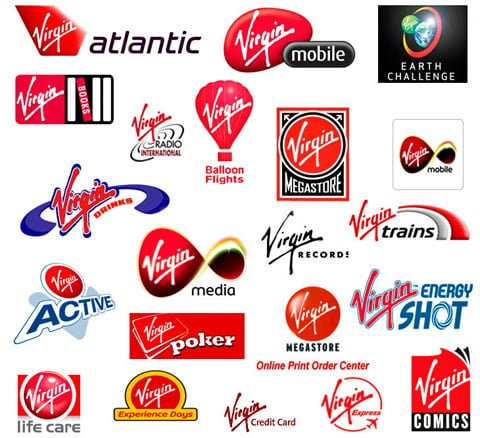
As I was browsing the ‘best of the week 63 on the Abduzeedo.com blog (abducted by design) I fell in love with this image showcasing how the Virgin logo has been stretched into different business areas.
Isn’t it cool when someone has created a logo so simplistic that it can be put into any context without loosing touch of it’s origin. Richard Branson is truly a mastermind when it comes to PR, marketing and entrepreneurship.
Here’s a logo that can stand time
by
Tags: