Category: Graphics
-
AI and Chat GPT4. To be or not to be?
Artificial Intelligence (AI) has been progressing at a remarkable pace in recent years, and Chat GPT4, the latest development, is no exception. While some eagerly await its open release, others call for its prohibition. How should we view this emerging technology? As with any innovation, it’s crucial to examine Chat GPT4 critically, considering the ethical […]
-
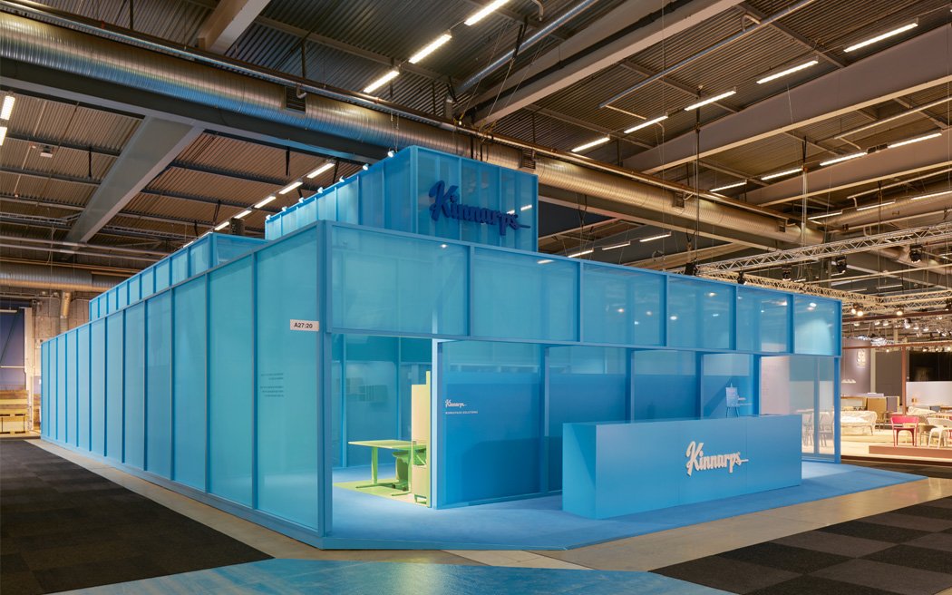
The Kinnarps stand 2017 – Editor's Award for Best Stand.
After creating a new brand and design platform for Kinnarps, one of the worlds finest workspace solutions brands I was asked if I wanted to design and then lead the implementation of the Kinnarps Stockholm Furniture & Light 2017 stand. This is the short story about that project. I early explained to Kinnarps that in […]
-
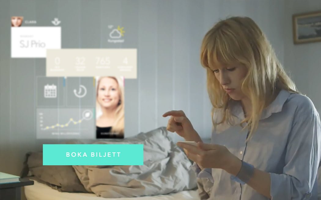
A prototype – SJ and a journey into the future
You might have seen the post I’ve written about prototyping. An innovation process I’ve developed in order to help global brands understand their future needs and based on that map out strategies to move them into the future business landscape. It’s part strategy, part creative development and part visualisation. Well, here’s another prototyping project one […]
-
On the future of Apple and iOS7
Yesterday I installed iOS 7 on my daughters iPhone. Shortly after she came up to me crying. I asked her what was wrong? – It’s so ugly she said. What is? – Everything daddy! This morning I woke up early and had some fun in photoshop. Is this the future of Apple?
-
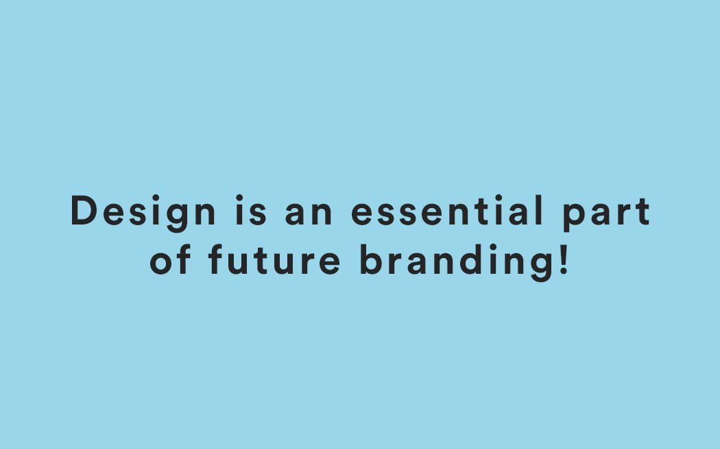
Why design is essential to future branding
I wrote a blogpost a couple of weeks ago about the three components of future branding; Authenticity, Innovation and Design. Today I though I’d dig deeper into the design part of branding. Why is it important, what does it mean and how do you know you’re on track. Why is design an essential part of […]
-
Case: Revamping Vasakronan. Swedens largest property brand.
Sometime last year I was approached by Vasakronan, Swedens largest property brand with a property portfolio valued at SEK 80.3 billion. Being a market leader the felt their digital presence had to reflect that position. Their question: What do we do? As always I teamed up with Caroline Karlström and accepted the challenge to answer that question. In […]
-
Continuing building the Marginalen Bank brand with a new commercial
As of monday this week you can spot the latest TVC created for Marginalen Bank. This sweet little flick is the latest short film (I see it more as a short film than a TVC) in a series of three (1 & 2) created by me for Marginalen Bank, the brand I took part in […]
-
How To Successfully Identify A Future Trend
I’m currently working on my 2011 brand and communication prediction. While I’m working on that I drew up one of the best models I know when it comes to predicting future trends. Enjoy!
-
So What About Volvo? Does Your Site Suck Too?
Yesterday I wrote a blog post about SAAB. It obviously created some sort of attention since I almost had a new unique visitor record. Among the commenters were official SAAB representatives, positive even though I had quite a strong tone in my post. Another commenter, a bit surprising, was David Holecek, Interactive Marketing Manager at Volvo […]
-
Case: The Story Of How Sweden's Newest Bank 'Marginalen Bank' Was Created, Implemented and Launched
What do you do when someone asks you to sign a non disclosure agreement and then asks you to spend the coming year planning, creating, implementing and launching a new Swedish bank? Say yes of course! This is where the story of the freshly launched brand Marginalen Bank starts. Together with recidivist Caroline Karlström I […]
-
Think People Will Read About Your Service? Think Again!
Time is precious. Don’t you agree? For example if I spend to much time here going on about this and that you’re gonna start to think ‘what the heck, get to the point you #%*#’er. So, I’m not gonna spend to much of your time. Instead. Have a look at these 5 demo videos and […]
-
Open Source Project Shed New Light On Graffiti
I love the Internet. When I least expect it someone somewhere has spent the last weeks writing thousands lines of code that turns something we’ve all seen into something none of us has seen. Today when I visited JoshSpear I ran into this open-sourced project called Graffiti Analysis by Evan Roth. This is exactly what […]
-
Lightbulb Packaging. If They Can – You Can Too!
People over here in Europe are getting ready to change their light bulbs at home due to a decision taken in the European Union a couple of years ago. This has triggered an earthquake of ideas on how to repackaging this old product that haven’t really seen inside of a designers room the last 50 […]
-
Case ›› Re-branding: Turning A Diving Brand With A Heritage Into A Brand With A Future
Last summer I got on a train leaving Stockholm for Gothenburg. Together with freelancing project manager, planner and colleague Caroline Karlström I had a meeting set up with diving brand Poseidon. This was the start of a project where I truly had the opportunity to work with all aspects of branding and creative communication. A […]
-
The Boy Who Lived – How a Comic Strip Can Make You Cry
Today I’m browsing for mood images. My search has led me to tons of newspaper blogs. Then suddenly as I noticed this comic strip below my heart stop for a brief second. This piece of communication is so simple yet so strong. If this would have a been an ad that ended with ‘Send Money […]
-
The Ultimate Mood and Storyboard Application
Creatives all over the world do their best to visualize their ideas when pitching clients, preparing for photo shoots or simply putting their ideas on paper. Apart from sketching with Sketchbook Pro I’ve personally been using Flickr and Google Image Search combined with Photoshop for ages. Lately I’ve added Bing and iStockphoto to the list. […]
-
Microsofts Future Interface Bonanza
A great site for finding inspiration is Fubiz. Their tagline ‘Daily Doze of Inspiration’ says it all. This morning when I was preparing for a speech on the ‘DNA of Creativity’ next week at an event arranged by Cap & Design, one of Swedens leading design magazine I stumbled on this wonderful video below from […]
-
Lighting up graffiti
In Paris, France there’s a guy named Aïssa Logerot. He makes all sorts of cool industrial design objects. The thing that got me hooked though was this outstanding LED spray can called halo. The photo says it all. I want one. For what I don’t know but that’s generally how I feel about cool objects […]
-
Here’s a logo that can stand time
As I was browsing the ‘best of the week 63 on the Abduzeedo.com blog (abducted by design) I fell in love with this image showcasing how the Virgin logo has been stretched into different business areas. Isn’t it cool when someone has created a logo so simplistic that it can be put into any context […]
-
It's all an illusion
Here’s a little something for you people out there who forgot to put enough Redbull in your drink tonight. 1. Stare at the image for 10 seconds. 2. Look at something — your hand, a book, your friend 3. Enjoy! Thank you BoingBoing.
-
How to work better by Peter Fischli & David Weiss
One of my favorite graphical drive thru’s is FFFFound. It’s a never ending source of inspiration. Today I found this image above, originally posted by Today and Tomorrow. It’s been made by Peter Fischli & David Weiss, the same guys that made ‘The Way Things Go’ which was the inspiration for the classical Honda COG […]
-
What the font was that?
That’s more or less the name of this ingenious new iPhone app that let’s you identify a font purely by taking a photo of it. I downloaded it and tried it – it’s a killer app! As often before it’s Miss Swissmiss that delivered the news about the Whatthefont app.
-
Just came home from Barcelona but wish I was in Great Britain
The British Royal Mail has released a set of stamps featuring British design classics. Great Britain is a wonderful country indeed. Don’t you agree? Getting a post card with one of these ‘licked’ to it would definitely put a smile on my face for the rest of the day. Thanks SwissMiss for the find!
-
A multifunctional logotype
Ran into this beauty of a logotype when I was browsing FFFFound today. Innovation in it’s simplest form.
-
A book about typefaces that makes you go wow!
Snow, food and wine. That’s why I haven’t been blogging away the last couple of days. I’m in the Swedish ski resort Tandådalen with my oldest daughter Ebba. I could not resist however to post this video showing this ABC3D pop-up book by Marion Bataille. It’s a true beauty and shows how innovation really makes […]
-
What a funny morning. But how funny really?
FFFFound got the good stuff as always.
-
Visualization makes things easy to understand
-
True, true.
If you’re heading a brand. Stop with everything you do. Head over to David Armano’s blog Logic + Emotion, cause the post that follows this illustration above might do a lot of good for your future career.
-
A poster that I like
Yahoo Pipes. A great tool. Right now I’m finalising my design RSS feed project where I’m putting more than 80 design blogs into a pipe and then after some filtering I can keep track of all 80. Sweet. Then as I tried it out today, out came a poster from a blog called DesignNotes. I […]
-
Peter Jaworowski and Fonterutoli makes life easier
Saturday. It’s half past ten and I’m working an idea for one of my new clients. The concept is pretty finished and I have this idea about how the art direction should be. As I browsed my feeds I found Peter Jaworowski from Bialystok, Poland. Peter is this great retouch, illustrator, master ‘photoshopper’. Spot on. […]
-
Communication is easy. It's the branding that is hard
Right now I’m in the middle of some planning work for a Swedish brand. I’m spending quite a lot of time trying to understand their products, their target group and especially their brand. When I’m working I like to keep a drawing pad close to me so that I can write down and doodle on […]
-
Art Lebedev Studio innovates
Fuck the rain. A creation by Artemy Lebedev founder of the design agency Art Lebedev Studio. I first noticed these guys back in 2004 when I used the Ardeæ folding chairs, one of Arts own creations, as a mood image for a BRIO pitch. I found myself loving the broad variety of projects found […]
-
Pixel art has become a vintage technology
There was a time when I hated pixel art. It was around 2000 when there wasn’t any need for creating websites with pixel graphics. It mostly felt stupid and took for ages to create something that looked stunning. Some years later adidas used the pixel art above created by Eboy (the Yoda of Pixel art) […]
-
Let me introduce OwaikeO
T his is starting to become a habit. Every now and then I find an artist, designer, photographer etc that just blows me away. I crave for a project that gives me the opportunity to call these guys up and work with them. OwaikeO is such a guy. His real name is Ahmed Al-Refaie, he’s 21 […]
-
The new Blossa Glögg bottle
I liked the first five years better. But here it is. The 2008 Blueberry Glögg from Blossa by BVD.
-
Sorry Mr Phelps
I was reading Mashable about Michael Phelps having one million Facebook fans dressed up with a Sports Illustrated cover with the 8 gold medalist on it. I’m really sorry for my blunt humor. But I could not resist retouching Mr Phelps a little bit. A psychologist would probably say I was stressed due to the fact that Sweden has totally […]
-
Should your creative idea be executed or not?
Ms Swissmiss found a pretty good answer to that question on Frank Chimero’s, designer, illustrator and tinkerer from Missouri, USA, website.
-
How to innovate a album cover using typography
That’s exactly what Funki Porcini’s has done when they have designed the cover for their new album Fast Asleep ILoveTypography served and I recieved.
-
A comment on Nokia buying Symbian
Read on Last100 that Nokia announced that they will buy Symbian. That’s all I have to say about that.
-
Everything communicates
We talk a lot about how logotypes, advertising, products, packaging, tone of voice, TV commercials, websites etc etc etc communicates the brand. But usually, the more business-oriented the purpose, the stiffer the creative executions. That’s why I just love to see infographics like these. How would the infographics look in your annual report next time if you were […]
-
Let me introduce Vladimir Gvozdev and BibliOdyssey
Sometimes you just end up spending time on a site much like when you enter a library. You feel good, spend quite some time eyeing the shelfs for something good to read. Visiting BibliOdyssey makes me feel just like that. Today I spent about 25 minutes just eye gazing the beautiful “historical” illustrations on the […]
-
First shock absorber on Mars?
In case you missed it there is now a lander called Phoenix on Mars. The thing landed 17:07 local time on Mars (what the hell that now is). This view of one of the footpads of NASA’s three-legged Phoenix Mars Lander shows a solid surface at the spacecraft’s landing site. As the legs touched down on […]
-
Adolf Hitler and his evil eyes
I ran into the image to the left of Adolf Hitler when I suddenly noticed that if you turn his eyes up side down he looks like the devil himself. Said and done. Now his looks fits his personality.
-
Old + New = Innovation
I just love it when people grab old ideas and turn them into new. At first glance I thought it was an ad for Fritz Hansen and though WOW. But it’s just (I love it) a great poster by Blue Art Studio for you to hang on your wall. Got it through Notcot.
-
Let's start changing the world for the better
In a world of war, violence, rape, isolation and loneliness we need to act. This is my modest contribution on a wednesday evening.
-
A great post on car logos
So you think you got it covered when you say – “Don’t touch the logo”. Heck the guys over at SAAB obviously forgot that rule. But on the other hand. Rules are meant to be broken! Car fan as I am I’m spending quite some timing reading car blogs. Then in the middle of everything […]
-
Things I Have Learned in My Life So Far
Not me! That’s the title of Stefan Sagmeister’s new book. And judging by Stefan’s list of 20 maxims we should all have something to learn from his life. Taken from Creative Review “The book is based on a list of maxims made by the graphic designer on his “experimental year” in 2000, where he took […]
-
It did.
Found on FFFound
-
Prediction nr 9, one step closer when Microsoft pulls out the big cash
Yesterdays bid on Yahoo by Microsoft is absolutely a step in the right direction. It’s also a confirmation of my prediction nr 9 in the presentation I held at Daytona Sessions in the end of 2007. What’s the next step? Hell, I don’t know. But I wouldn’t be surprised if the old Microsoft logo ends […]
-
It's 28 years ago but he still makes me smile.
I just happened to see one today when I was surfing the web. And I got all warmer. He’s timeless!
-
An insight into the conceptual work behind the Beijing 2008 Olympics logo
Everything you create starts with an inspiration from an earlier event in your life. You might have seen something, heard something or experienced something. Now we know what the inspiration behind the logo for the 2008 Olympics was. Thanks AdArena for sharing this with us!
-
Kosta Boda is ‘In love with art glass'
Ah, I know. Some of you think we only do digital over at Foreign. Here’s a little something to prove different. Kosta Boda, one of the leading and oldest glasshouses in the world asked us to develop an idea for print placements in glossy magazines and larger outdoor billboards to follow up last years success. […]
-
Google celebrates the 25th birthday of Internet
On January 1, it was exactly 25 years since the precursor to the internet, ARPANET, switched over to TCP/IP. Pingdom brought to my attention that Google celebrated by changing their logo. The cablers in the logo read “2008”. But added to that they’ve placed a almost not visible easter egg. It reads SYN SYN/ ACK […]
-
Pantone selects color of the year for 2008
Wondering what clothes to wear, what car to buy, diamonds or gold? As long as there’s some Blue Iris in it you’ll be home safe. Pantone has been the world’s color authority for more than 45 years. And every year they forecast which color will be the ONE color for designers the year that comes. […]
-
Send your doodles online
The Moleskine Project is this artist oriented website made to help both good and ”not so good” artists to promote their work and ideas. The main idea for the project is that everyone has an equal right to participate. No one is more equal than the other. Being artists themselves, the people behind the Moleskine […]
-
Same same but different as Gabor Palotai and Grey Tel Aviv creates.
Everything has been done. In 2005 Designer Gabor Palotai came up with an awarded poster for the exhibition Estonia at the Sjöhistoriska museum in Sweden. Now, 2 years later Jonathan Stirin and Ben Sever, both employees at Grey Tel Aviv has come up with a set of ads for Greenpeace. The resemblance is striking, but […]
-
Working with Colors. Have you found Adobe Kuler?
If not, then it’s about time. All designers are every now and then faced with the challenge to find a color palette. Adobe has created this fantastic tool called Kuler where you can explore, create and share color palettes. And it’s for free. Create your own color themes here.
-
Ken Hauser scares the hell out of me
Ken Hauser from Amsterdam has created som killer graphics. This being one of the most provocative ones. Check out more of his work.
-
What can old established marketing models teach us who work with the advertising and communication of tomorrow.
A possible solution to that question made me go up 02:19 this morning and adapt one of the oldest and most established models to the world of online communication. I’m talking about the classic consumer adoption process that divides the consumer into five groups: Innovators, Early adopters, Early majority, Late majority and Laggards. This old […]
-
I'm a fan of the Flying doggiestyle.
Have you heard about Flying Dog Brewery? No. Well, then it’s about time you do. Flying Dog is this kick ass brewery founded by copywriters, illustrators and advertising professionals. Their attitude is raw, fun and very unique in the business of brewing beer. What Flying dog is doing different is basically just that. They’re doing […]
-
Blossa Julglögg. It sure looks nice, but what the hell is?
Packaging design like this makes me proud of Swedish traditions. Every year as christmas approaches Swedes drink Julglögg. It is sort of a gathering where you meet up with old friends and eat Lussebullar and drink Julglögg. The Julglögg is a kind of spirit that is filled with sweet stuff. You buy it, warm it […]
-
I wanna go to Canada
A beautiful posters from back then. It makes you wanna go, doesn’t it? Fetched from FFFOUND
-
Let's design more and better
Thinking about how to fit design into your business. Follow this link to a wonderful and insightful with practical ideas and real-life examples of just that. Found it over on the SwissMiss blog.
-
FC Barcelona have unveiled the design of their new Camp Nou stadium by Foster + Partners.
Barcelona, owners of the Camp Nou, one of the coolest Football stadiums in the world are about to rebuild their stadium. And the new one is a KILLA! Find all the information where I found it, at the Dezeen Blog.
-
Copywriter's birthday card
I love it!Picked it up onCore 77
-
A comic book to support the adidas Impossible field campaign
The launch of the Impossible Field website to compliment the TV campaign, detailing the launch of a new range of adidas products. Background The launch of adidas’ latest range of products was to steer clear of outright “selling” was our brief from adidas for this project, and it was also to demonstrate the products’ superiority. […]