The other day I was happy to see that Per Torberger, former writer at Resume, one of Swedens leading media papers, had kick started his blog Pers Värld. Welcome back Per!
One of Per’s first post highlighted the ongoing Swedish discussion about the new 2009 Swedish European Presidency logo made by Bacon. Both Resume and Cap & Design, mainstream media and a lot of Swedish blogs have highlighted the news. Dagens Media, another Swedish media paper got an ongoing poll going where 83% thinks SEK 1.3 million is to much for the logo.

Per posted his thoughts in Swedish, and focused on replying to what most people seemed to comment about. Bear with me as I try to translate to you guys who don’t read Swedish.
(freely translated from Per’s blog)
- ”Wow, SEK 1,3 million for a logo – how the hell can it cost so much!?”
- ”No, it looks like Stockholm Opens (tennis tournament) old logo/other logo” or “It’s ugly”
Per didn’t seem to think that SEK 1.3 million for the new logo was to much. And mostly concluded that people who commented on the logo were focusing on the wrong things and not really understanding that design is first and foremost about differentiating a brand rather than decorating it.
I first made a short comment on Per’s blog where I said the following:
“It would have been really exciting if one had launched a competition for about 1000$ on 99designs.com, spend 10 hours on writing a good brief. After use up another 10 hours to Art Direct the contributions.
You would probably have seen 200-300 contributions of which 30-50 would have been good. Spend another 20 hours finetuning the work. The final check would then have been SEK 100-200 000 and crowdsourced. This would have been a cool case that in it’s turn would have generated more attention in both Sweden and abroad.
Is the logo ugly? – no point of view. Ugly can be good, beautiful can be bad in these cases.
Is it expensive? – No, not if you hire a traditional agency and use a traditional way of producing it.
Pling.”
After some bouncing back and forth Per asked for a real case. Right after his last comment yesterday, as sent from the gods came this:
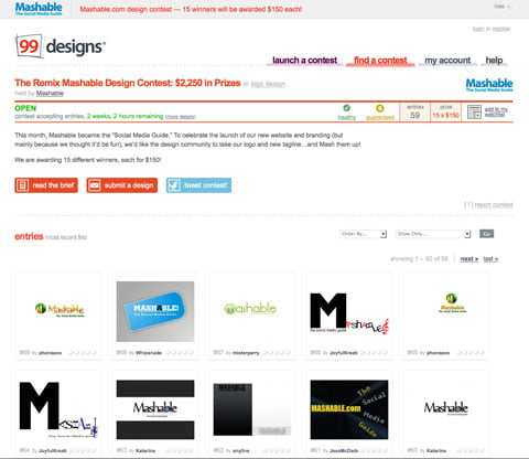
To celebrate the launch of their new website and branding the splendid ever source of information Mashable launches a social design competition on 99designs where their visitors are briefed to ‘mash up’ the Mashable logo.

Mashable didn’t dare to re-do their real logo, or at least not yet. But they did launch a competition. When I started to write this post they had 15 logos uploaded. Now as I’m getting to the end of this post they’ve got 67! contributions and tons of conversation going on. 67 in just a couple of hours!
The competition goes on for another 2 weeks and I actually think we’ll see thousands rather than hundreds of contributions.
Rock on Mashable!
Let’s sum up:
Do I think the Swedish government spend to much for the new European Presidency 2009 logo?
Yes of course. But it’s not about the actual cost. It’s about the entire process!
To me, this is about integrated communication. Do not isolate your logo work as a separate activity. If someone would have thought different about the entire process of designing this new logo they would have done just what Per said in his post “helping the target group to choose that product in front of the competition”. (and saved SEK 1.1 million for other activities)
This is what innovative communication is all about. No single activity must be performed without gaining the overall objective. That means that everything we do should outlive budgets and on top of that generate a social buzz and PR.
This logo will not do that!