I‘ve spent some time this evening browsing my favorite packaging site The Dieline. That’s when I suddenly realized I should blog about packaging today.
When I speak about creativity and innovation and how it must be a part of every interaction (especially packaging) you have with your customers one of the most common replies I get is: “How can I make use of what you say in my business. We don’t have a sexy product”. Wrong question!
Today no one, no matter what kind of product you market, can overlook the fact that your customers lead a stressed life. People want to be entertained. We want drama. We want smiles. We want to feel. Everything is about entertainment and drama! Brand owners – inject emotion into your products or eject yourselves from your position!
The one question you should ask yourselves when it comes to packaging is: “Does my packaging make people smile”
Here are 10 brands that obviously have understood that you can make something out of anything.
1. Rellana Wool – Making Yarn Come Alive
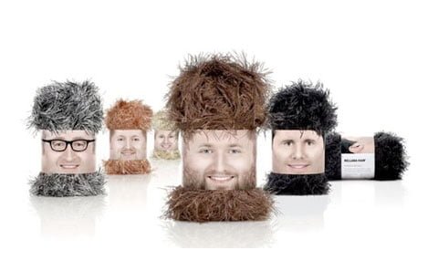
This wonderful wool packaging concept called Wolly Heads was made by Ogilvy Frankfurt– It’s one of my absolute favorites. They’ve turned something very ordinary into something not so ordinary. This stuff makes me wanna learn how to knit stuff.
2. Clarence Court – I’d Rather Have Some Eggs
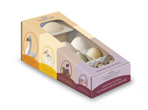
When you think of egg you think of…ehh…eggs. That’s until someone comes along and makes you think different. That’s exactly what UK based design agency Simmer makes you do with this wonderful concept for Clarence Court. One Goose, two Duck, two Pheasant and three Quail eggs. Makes you wanna make an omelette faster than you can say cheese huh?
3. Dumpling Dynasty Sewing Kit – I Can’t Resist It
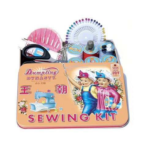
You probably have a set stuffed away in a drawer somewhere at home – a sewing kit. Doesn’t ring any emotional bells in your belly huh? Well, then imagine when you walk around in the shop and then suddenly feast your eyes on this little beauty. Sewing Kit reinvented huh! Illustrator Fiona Hewitt knows how to kick ass obviously! ps. If you like it a lot. Then you can shop it here.
4. Pregnadel – I Wish I Was Pregnant!
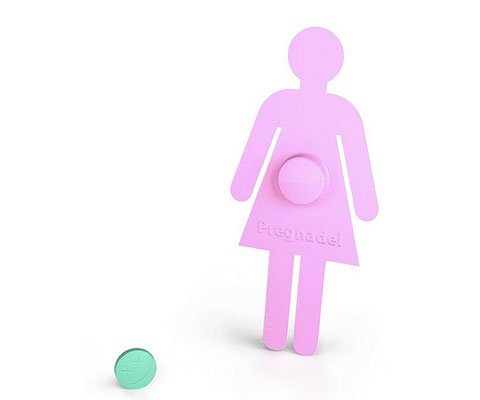
Here’s a packaging concept by a design student named Sergii Llin that clearly shows you what it’s about. “The goal was to develop packaging that will be noticeable on the pharmacy shelf, self-illustrative, and have a bit of social message, kind of ‘Think before you do”
Extremely smart – a packaging that even acts socially responsible. To bad it’s not made for a real drug.
5. Prism London – I Can’t Believe My Eyes
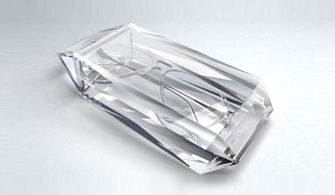
There’s a design agency called Sabotage. It’s obvious why they’re called that cause when they get their hands on something they obviously destroy the competition with excellent pieces of packaging. This crystal-like eye case is no exception. It’ll crack the competition and make customers spend money they don’t have.
6. Bolt Barbers Shaving Cream – Getting A Shave Have Never Been Cooler Than This
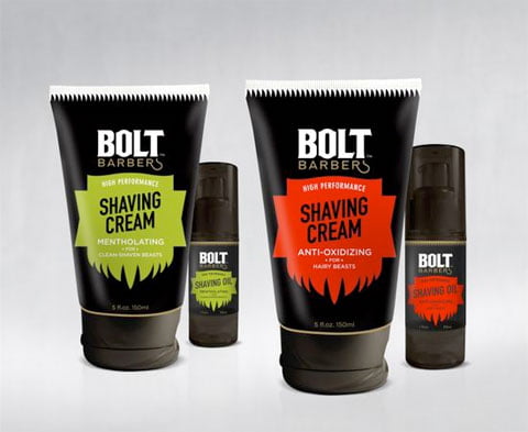
Shaving cream. The pure sound of those two words make you wanna go to sleep. The section in which you find these products have looked the same the last 15 years. And then something happens. Perspective Branding decided to bring the cool to the cooling products. Simple yet smart and differentiated from the rest.
7. Perricone MD – The Kind Of Medication I Need
![]()
In the United States there’s a doctor called Perricone. He’s sort of guru dermatologist to the stars and his brand Perricone MD have enjoyed extensive media coverage on Oprah, PBS, Larry King and in Vanity Fair, Vogue and The New York Times. Well, when you see the packaging made by California based design agency Concrete you suddenly understand why.
8. Lemon Powder – It’s Not As Sour As It Sounds
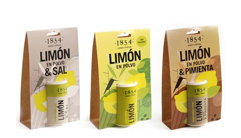
Estudio Clara Ezcurra. You can almost hear that this agency create stuff that makes you go wow. Lemon Powder – Most design agencies wouldn’t touch that stuff. But these guys from Argentina turned makes it poke your eyes when you pass the product.
9. Ecolean Lightweight Packaging – Proud To Be A Swede
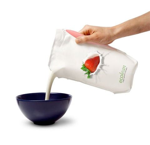
Wonderful! This new packaging concept called ‘Ecolean’ really blows my mind. It’s super thin. Minimum waste. Yet it’s stunningly beautiful. It makes people think environment. When you’ve consumed what’s inside you can throw away what left with a clear conscience. On top of all this it’s also a Swedish product. And since I’m from Sweden it makes me all warm inside. Here’s a video telling you more about the concept.
10. Bar Codes – It’s All In The Details
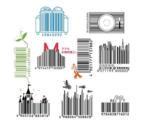
Last but not least. When you’re done revamping your packaging. Don’t stop there! There’s still room for more innovation. The bar codes for example – what can you do with them? If you lack imagination – give D-Barcode, the designers behinds these sweet set of japanese bar codes, a call.