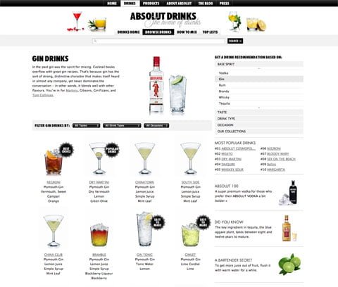
One of the worlds most awarded websites has been redesigned. And the way Absolut.com is heading doesn’t come as a surprise. The new site has been give an slick, well designed user and SEO friendly interface. Many parts of the site has been moved from a flash based interface to a classical CSS based interface. Everything is done with the touch of Absolut.
This is definitely a first switch from Flash based sites of many to come. I’ve personally been part of building lots of flash sites through the years. But the possibilities to create rich user and SEO friendly interfaces with CSS gives us no reason anymore to use Flash for entire sites.
Also the fact that marketing departments around the world have undoubtedly noticed that their visitors leave after seeing that first loader will lead to change.
All in all I like the new Absolut.com better than the old. But there’s a few things I would have done differently:
The flash intro
Get rid of it. It takes time to load. We’ve seen it before and it doesn’t ad anything. There must be something different you could do with it?
Products
Why do you still separate the product experience from the brand campaigns. Integrate this better. The shouldn’t be any need for me to visit both products and a campaign site anymore. Mash it up! Also, why can’t you let people rate, comment, trackback, tag etc. Afraid of getting bad publicity?
YouTube integration?
The site has taken a step from interactivity to passivity. Why aren’t there any videos? Absolut could easily create the worlds most visited YouTube channel that could be reflected on Absolut.com. I think the time is over for sites that look to draw all traffic to their own site. You’ve gotta distribute your content in all different channels in different ways. And Absolute should be ahead of their game here.
Where’s the conversation?
Ok, we’re aloud to comment on blog posts etc. But where’s the stuff that generate conversation. Google Friend Connect, Facebook Connect, social sharing, commenting, reviews, ratings, user generated drink recipes, ideas etc.
The blog?
Jacob Nielsen once said “People spend most time on other sites”.
Why is the new blog some sort of innovated blog that actually works bad compared to established blog standards. I think we could have expected more from Absolut. And why not base it on WordPress? This way it would load faster, it would give you access to hundreds of thousands features created by the open source community. It would give you credibility too.
Innovation?
Last but not least. I definitely think that this new site is nice. But it doesn’t ad anything in my book. Absolute has taken a step 5 years back from an innovation stand point of view. This is an ordinary site with some flash content and beautifully designed pages. I sure hope we don’t end up seeing this site staying on as a launch platform for new flash based campaigns but instead see more true but user friendly innovations that reach the broader audience with the Absolute brand message still intact.
So, conclusion
Original conclusion
This new site cannot be a strategy coming from online savvy people cause the tactical execution is great. Someone has identified that Absolut.com as it worked before didn’t deliver on usability and SEO and therefor needed to be changed. The project must then have been controlled by people within Absolut’s organisation who doesn’t understand how to create the next generation web presence.
Alternative conclusion
I’m totally wrong and this is the first to come of many releases that will put Absolut.com on the map again. But then I also expect a switch to open source, mash ups, conversation, openness etc.