People over here in Europe are getting ready to change their light bulbs at home due to a decision taken in the European Union a couple of years ago. This has triggered an earthquake of ideas on how to repackaging this old product that haven’t really seen inside of a designers room the last 50 years (or at least it feels that way).
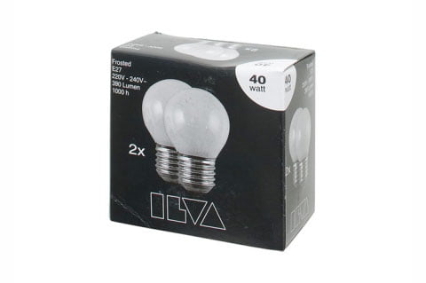
This is more or less what the industry has offered us the last 50 years
Sometime last year I noticed that this business is on the move. As I was shopping bulbs it struck me that good shit is happening inside the hardware store on the light bulb shelf. What the light bulb industry is going through is a great inspiration for any business lost in history and it shows that once you get that ball rolling things will happen fast.
Here are 10 light bulb packaging concepts that leads this industry forward
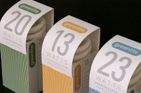
Sweet and Informative from Greenlite found on Aaron Skippers blog.
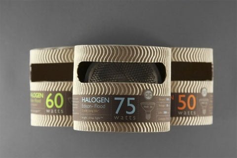
I just love this one by Mongkol Praneenit found on Definite Touch
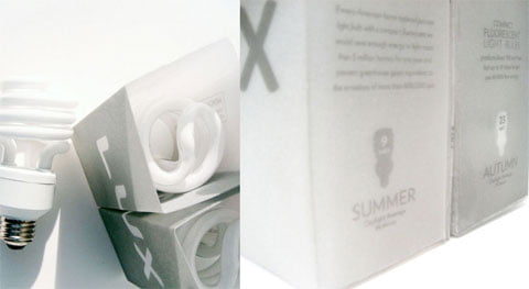
Lindey Cull does summer and autumn packaging 🙂
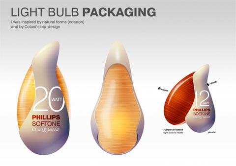
A wonderful packaging concept by Sasha Grishin
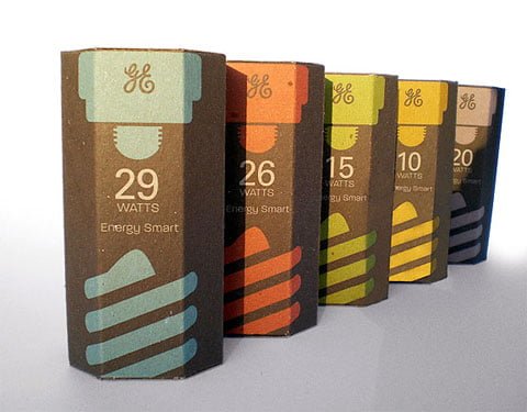
Kevin Kwok wraps up some bulbs in this concept found on Kitsune Noir
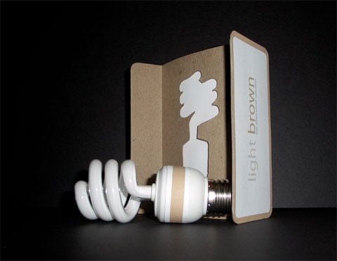
Yet another concept that shows the business is on a move. By Elbert Miller.
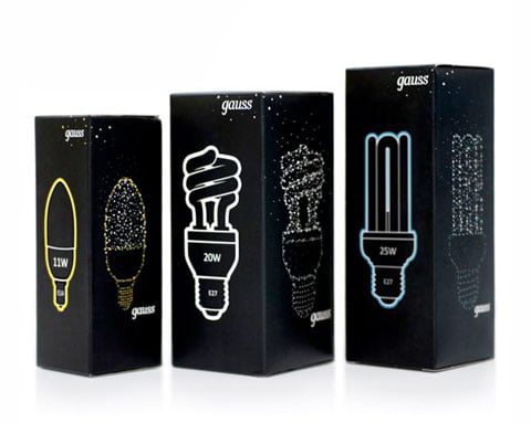
Embody3D posted this one. Simple yet inspiring.
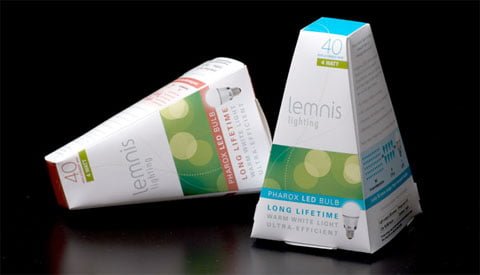
Not all of them are square! Lemnis found on Meldel stands on solid ground
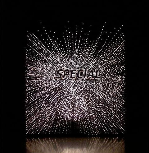
Emotional yet simple design from Anke Weiss found on Treehugger
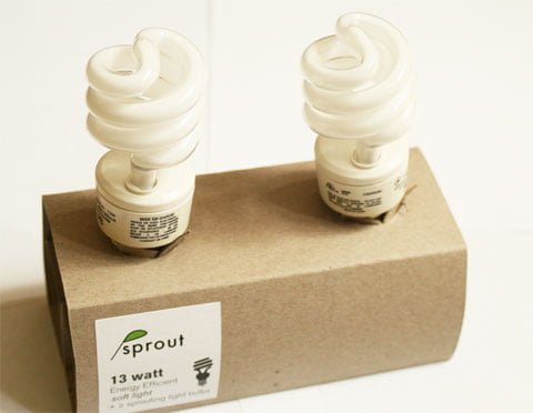
Finally this packaging from Sprout found on Flickr serves as my last example
So there you are. These guys are from the stone age and they did it. What’s stopping you to revamp your brand?
(Also – one could post yet another solely on the actuall bulbs. But no time for that right now 😉