Yesterday I wrote a blog post about SAAB. It obviously created some sort of attention since I almost had a new unique visitor record. Among the commenters were official SAAB representatives, positive even though I had quite a strong tone in my post. Another commenter, a bit surprising, was David Holecek, Interactive Marketing Manager at Volvo Cars. In his comment he wrote – “Sticking my neck out a bit, it would be interesting if you would do a similar exercise on our volvocars.com site (or rather volvocars.se, as we do not have all the shopping tools on our international site). We may be asking for a potentially harsh treatment :-), but feedback is always important.”
I was planning to do a video on the Volvo site as well, but due to kids at home I’ve not gotten the possibility to record something yet. It’s just to noisy! But, David, I decided to give you some feedback anyway.

I only walked through the XC60 part of the site since I’m more or less looking at buying exactly that kind of car right now. (Probably the new BWM X3, but I do like the XC60)
It’s sort of two-faced but here we go.
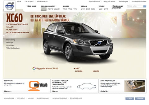
- You’ve done your lesson when it comes to usability. Most things work the way they should part from minor things when I’ve already chosen a car and then have to re-choose it once I wanna testdrive for example. I like that I can have a PDF mailed with my built car.
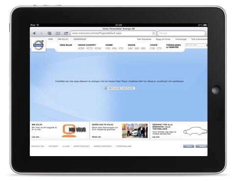
- The ‘closed’ interface forces me to navigate to much. Create less pages with more content instead. People don’t care about scrolling if they’ve come to the right place. Especially not in iPads and iPhones.
- Drop the http://www.volvocars.com/se/all-cars/volvo-xc60/Pages/default.aspx link structure and implement a more SEO friendly structure and taxonomy.
- I’d implement a lot more links between the sections. Such as moving people from the ‘What XC60 should I choose’ into the configuration tool for example.
- It’s all built in Flash. That sucks from several known reasons.

How Volvo Cars look on the fastest growing internet platform in the world…not good.
And probably lots of more things. But…time…kids…
What if it looked like Apples website?
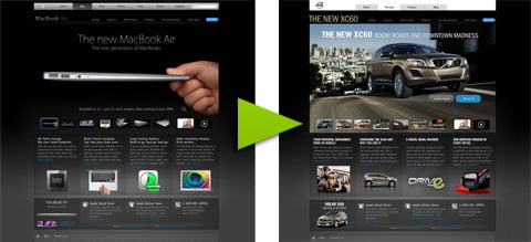
So, how should it look then? That’s of course a big thing to give feedback on and it would take some time, on the other hand, it’s sort of interesting to have a look at Apple, then swap all the content for Volvo Car content and see what happen. Hmm, why not try it? Said and done. I sat down for an hour and overlaid Apples Macbook Air section with XC60 content just to see what would happen. Here’s the result.

XC60 First page in an Apple Costume.
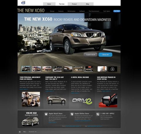
I’ve more or less just swapped content except for some copy that I quickly wrote to convey the right feeling. Don’t mind the top nav, it’s just there to get that Volvo feeling into the site. Click here to get the full view

Note. The design above is only produced for teaching purposes. Not to be used commercially
Volvo XC60 – The Design in an Apple Costume (excuse the mega long image)
By building the entire design experience, with designer videos, galleries and more, into one single page, you’ll award the visitor by letting him explore everything about the design without having to open new pages. You’ll also ensure that every link to the new Volvo XC60 design section delivers the exact same experience. You’ll have seconds to get people to stay, dont waste them on endles menus. Click here to get the full view.

Note. The design above is only produced for teaching purposes. Not to be used commercially
So, with that said (or designed…copied… in an hour). I think the Volvo Cars site features some sweet content and nice functionalites, but I’d repackage them into HTML5 based websites, lesser menu options and a bolder feeling to it. Obviously I’d spend more time than this to really work out how it should look in the future. Cars are beautiful objects made to be used by people so their sites should be too.
Thanks David for reaching out and I hope I’ve give you something to think about!