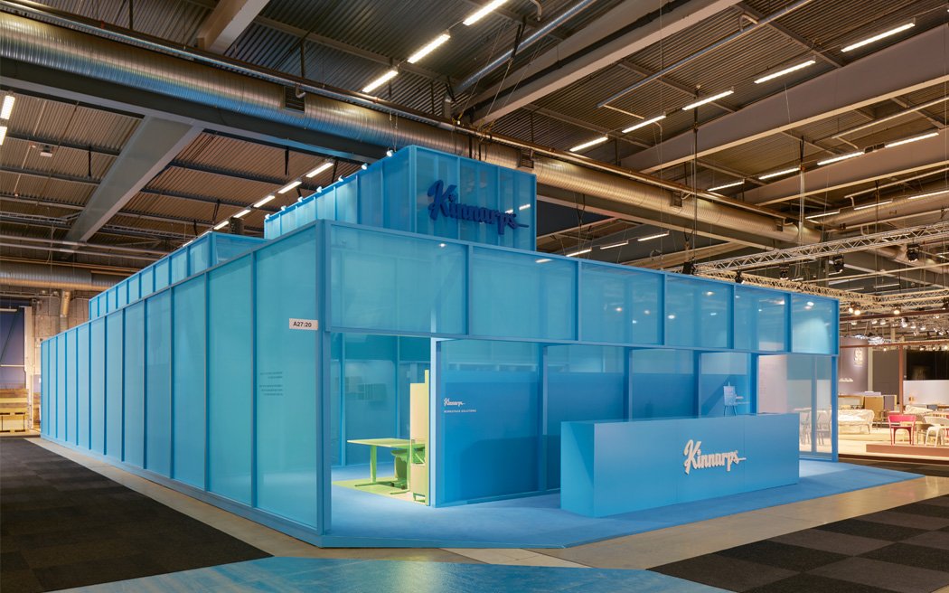
After creating a new brand and design platform for Kinnarps, one of the worlds finest workspace solutions brands I was asked if I wanted to design and then lead the implementation of the Kinnarps Stockholm Furniture & Light 2017 stand. This is the short story about that project.
I early explained to Kinnarps that in my opinion we should create more of a manifestation of the brand rather than a classical furniture stand. People and customers can experience tons of beautiful products at the fair, but few brands dare to focus on an emotional brand experience where products becomes one of many elements. I quickly knew that I wanted to create something stunning. Something that was larger than life. And of course something that really celebrated the Kinnarps brand. We needed to be the talk of the town!
Once I had created the outlines of the concept, mood boards and a clear idea of the inside elements I contacted Förstberg Ling, two young and fairly unknown, but extremely talented architects. I’d been working with them before and I felt they wouldn’t have a problem working together as a team. I needed to work with someone that understood that this was a teamwork. I had a very clear idea of where the Kinnarps brand were heading and there wasn’t room for old fashioned “roles”. We needed to mix Förstberg Ling’s expertise with mine. We needed to hold the that drawing pen together so to say.
When me and Förstberg Ling started the project to create the Kinnarps 2017 experience at the Stockholm Furniture & Light fair we spent a lot of time thinking about the modern workplace. What is it really about and in what way can Kinnarp continue to contribute to better workspace solutions? Technology has shifted the balance of power from companies to their employees. The only way to attract the future breed of employees is to create workspace solutions where people can thrive and grow. The architects, the interior design industry and of course Kinnarps play an important role in creating sustainable environments that nurture conversations, creativity and ideas. Kinnarps has a role to play here, we need to be conversation-starters and create products and services that can be adapted to corporate cultures and create the right pre-requisites for productivity and innovation. When we created the Kinnarps 2017 experience the rationale was the same – to construct a conversation starter.
Spacious environments for productive conversations
Me and Förstberg Ling spent the summer bringing the concept to life. Working with the new brand platform I’d created and staying true to the new color palette and the tonality was important. In the midst of the beautiful Swedish summer we met up in Stockholm and their hometown Malmö.
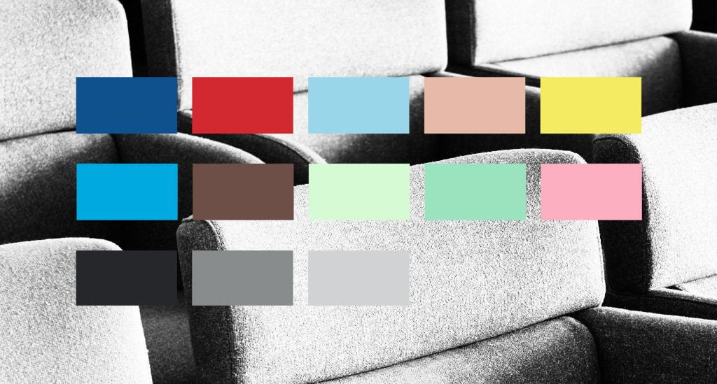
The new Kinnarps brand color palette.
We explored different concepts, everything from extreme simplicity to extreme complexity, but always on brand. We set up mood boards with inspiration from all kind of cultural expressions and design work. As time passed the concept became more clear. And we started to try different colours and shapes in renderings.
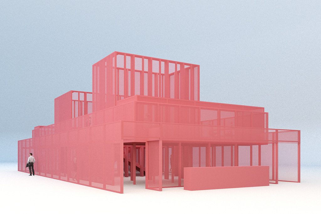
The brief clearly stated that Kinnarps wanted a closed environment in order to be able to register visitors through the system the Stockholm Furniture Fair provided. We had clear guidelines in the brief when it came to which products to show. The targets in terms of amount of visitors, PR results, sociala media presence and so on was also part of the brief. When I direct a brand activity I always honor the brief carefully while at the same time it’s also my obligation to push the client and their brand into a new dimension. People who visit the fair are extremely occupied and if you are to make an impression you’ve really got to stand out and make an emotional impact that leaves an impression in the mind of the visitor. You have to make the complex easy to understand.
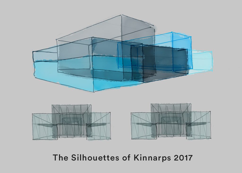
The Silhouettes of Kinnarps
In August 2016 I presented our concept in the Kinnarps HQ. We called it the Silhouettes of Kinnarps. This 75 year old brand has created many beautiful furniture but when most people think of Kinnarps they think of an office chair and the silhouettes of office chairs are recognisable from miles away. Our idea for the stand was born from this observation.
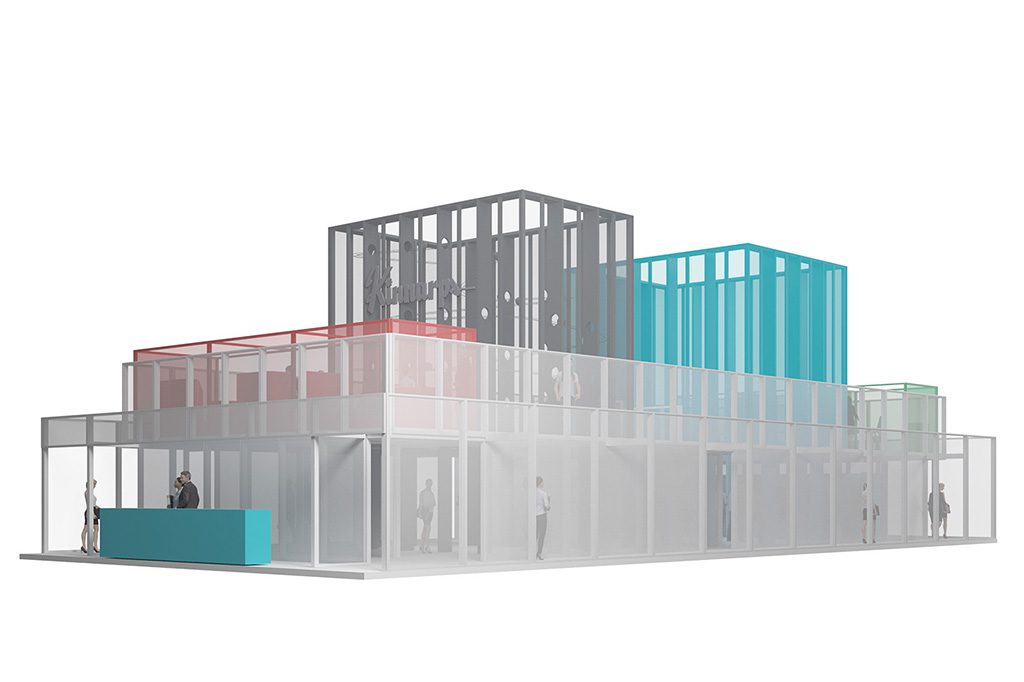
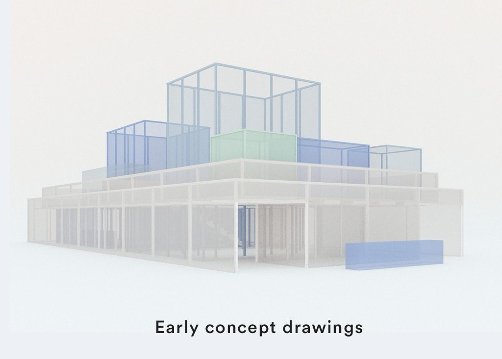
Very early renderings that shows two towers including a roller coaster built into one of the towers.
However, the future of Kinnarps is not only about office chairs. The future of Kinnarps, and any other brand for that sake, is people. The challenge of any strong brand in the world spells people. The ability to attract great people to your organisation and then make sure they grow both as professionals and individuals is key for any brand. This is done by building companies around people and not the other way around. The Kinnarps stand was created to reflect this.
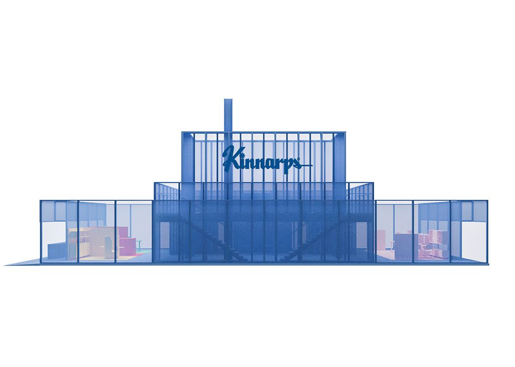
A rendering from the side to show the transparency of the stand.
Monochrome product experience
We presented a monochrome coloured semi-transparent construction where people was part of the experience. I wanted the stand to be a conversation starter, a space where people experienced things and shared ideas. I presented the idea that we should go with monochrome colouring of all products. I said to Kinnarps: I want people to talk about our expertise in producing great workspace solutions, not what color we think you should have in your office this year. Kinnarps bought into the idea.
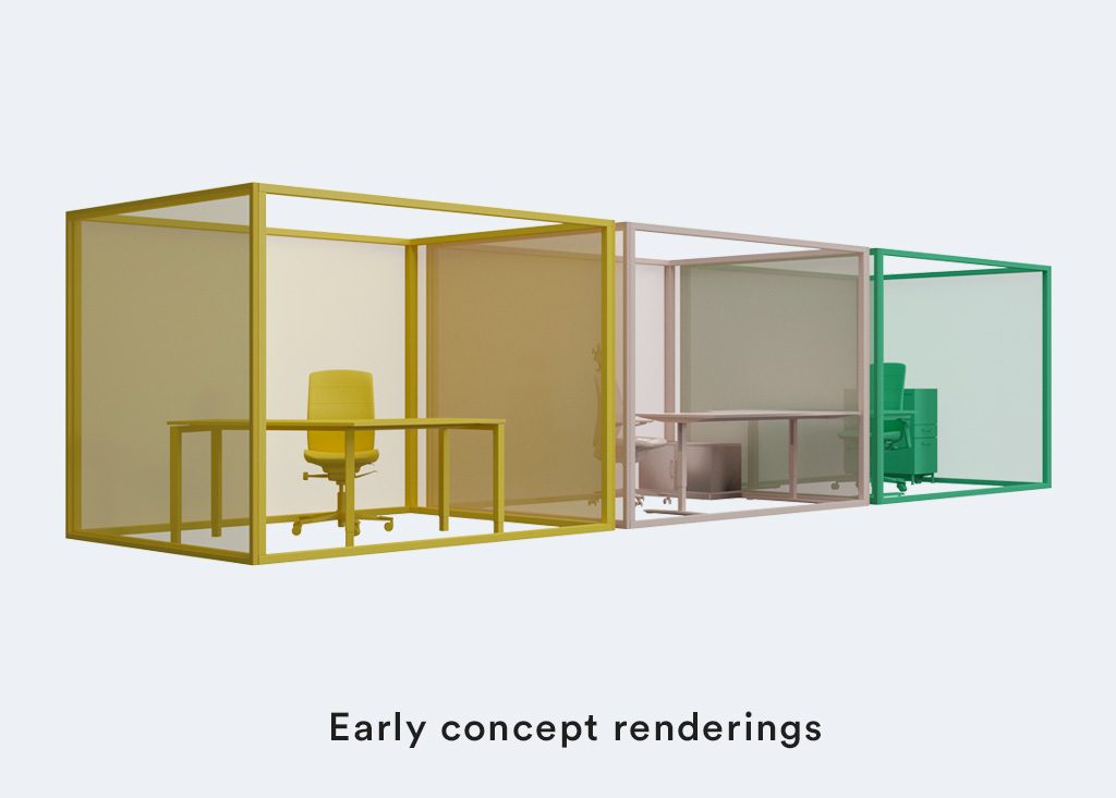
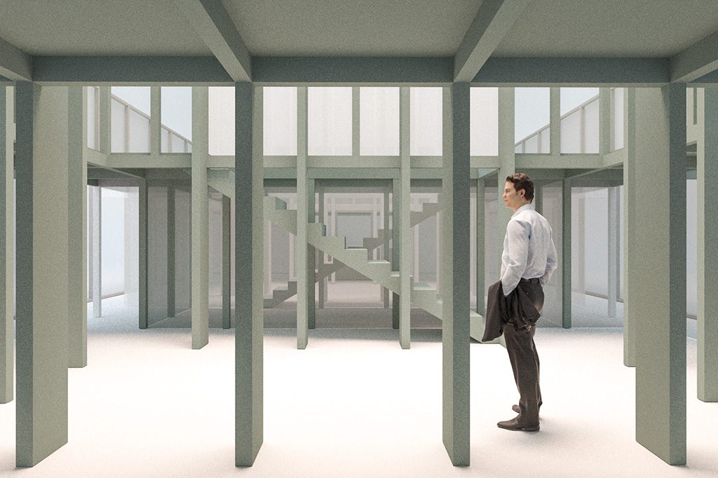
Visualising ideas in 3D early in the process.
We created six clear workspace solutions in monochrome colouring. Each one representing different challenges in the modern office. Focus points, meeting spaces, temporary workshop stations, creative environments and open office solutions. All of these workspace solutions were monochromed by Kinnarps custom construction department. I had the privilege to meet many times with this department in Kinnarps during the fall and together we decided on materials and components. The end result was stunning product booths with simplified hand built office equipment that didn’t compete with the product experience. For me it was extremely important to present the products in stunning yet unique ways. People would hopefully like it, but if they didn’t they still were left with a strong brand impression.
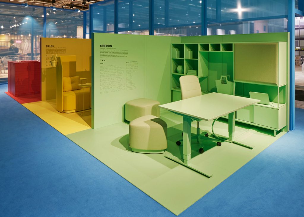
The Kinnarps crew did a fantastic job customising the products. Photo by Åke E:son Lindman
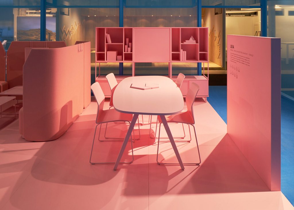
Monochrome product presentation. Photo by Åke E:son Lindman
The right team.
Once the concept was approved we broadened the team. As many times before I had the project manager Caroline Karlström on board to make all of us do a better job. I also asked Matt Carey to be my supporting copywriter. When I do these projects I often write the copy direction myself but being Swedish also means I’m not a native english speaker so Matt if often my copy in arms.
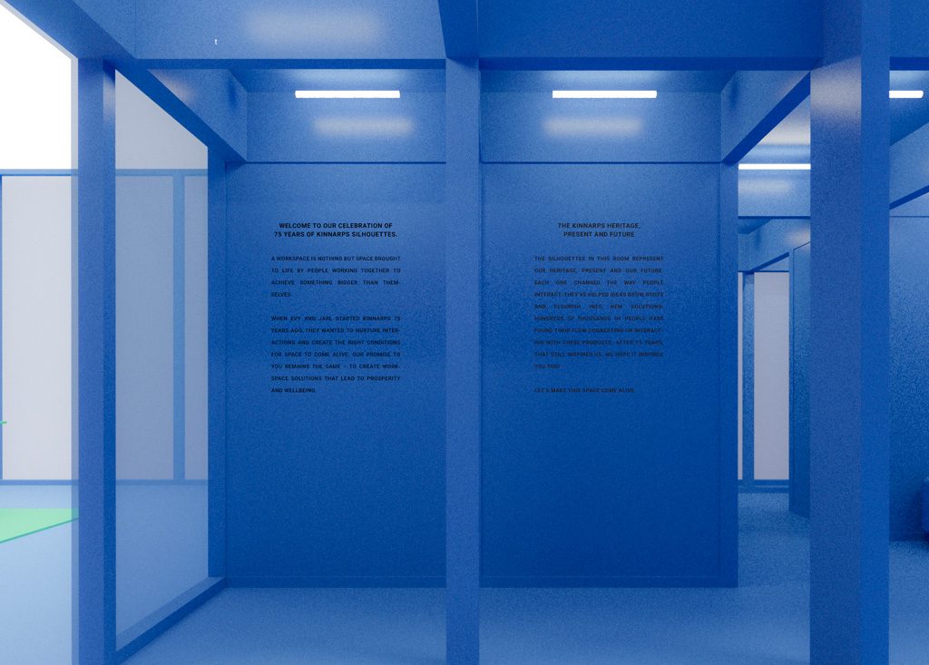
Carefully written copy on the walls was part of the experience.
Together with Kinnarps we now started to plan the implementation of the concept in detail. Me and Förstberg Ling refined the construction many times. We tried different colourings of the construction and also different designs. Always with the main concept intact.
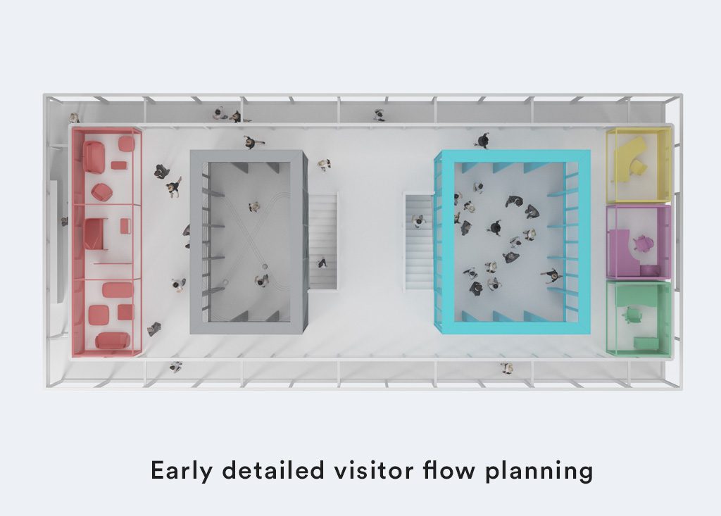
We spent a lot of time planning the customer flow in the stand.
As the months passed we added lots of small but strong elements to the concept. We had a small brewery, close to the Kinnarps factory, produce juices in colours that matched the stand. These juices were given unique names that makes you think about workspace solutions We developed a Pecha Kucha concept around well being. We created catalogues that were designed to fit perfectly into the reception desk. Of course copy and messages through out the stand were both written and designed to blend in perfectly.
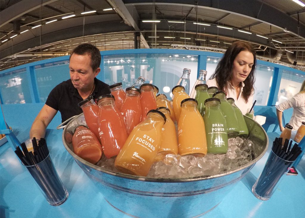
We created juices in the brand colours with messages connected to the brand
The Kinnarps 75 year micro-museum
One really special component in the stand was the celebration of Kinnarps 75 years. I created a micro-museum inside the stand. A set of displays with 3D printed objects lit up by screens in the bottom. A place for contemplation, reflection and knowledge sharing. This small exhibition consisting of 7 hand built displays were built by WEDO, another small but great company that I’ve worked with for our BAUX stands. In 2016 WEDO created a custom built robot for the BAUX stand. Feeling comfortable with the quality of their abilities to construct things I asked them to realise my idea.
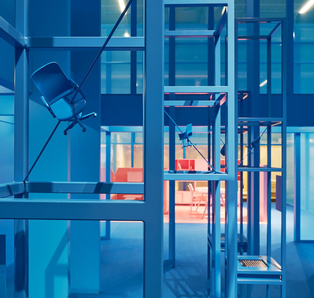
3D printed objects became conversation starters. Photo by Åke E:son Lindman
WEDO took on the challenge and just before the fair opened they installed the displays. This part of the Kinnarps stand became a great conversation starter and it communicated both the Kinnarps history and future.
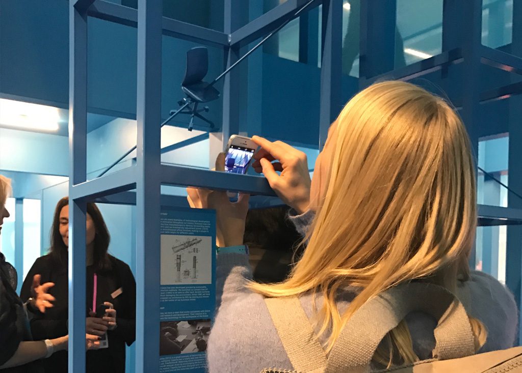
It was the most visited and photographed stand in the Kinnarps history
The end result was stunning. When I arrived at the fair a couple of days before to inspect our creation I was really happy to see that everything we’ve set out to create.
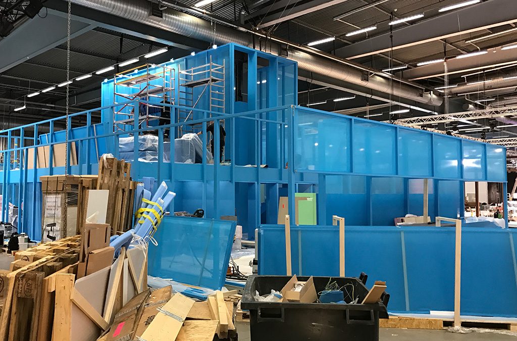
After months of planning the concept is finally taking shape.
We worked together with Pen Interiör and they had done a fantastic job. All the things I’ve envisioned had come to life and together they formed a fantastic brand experience.
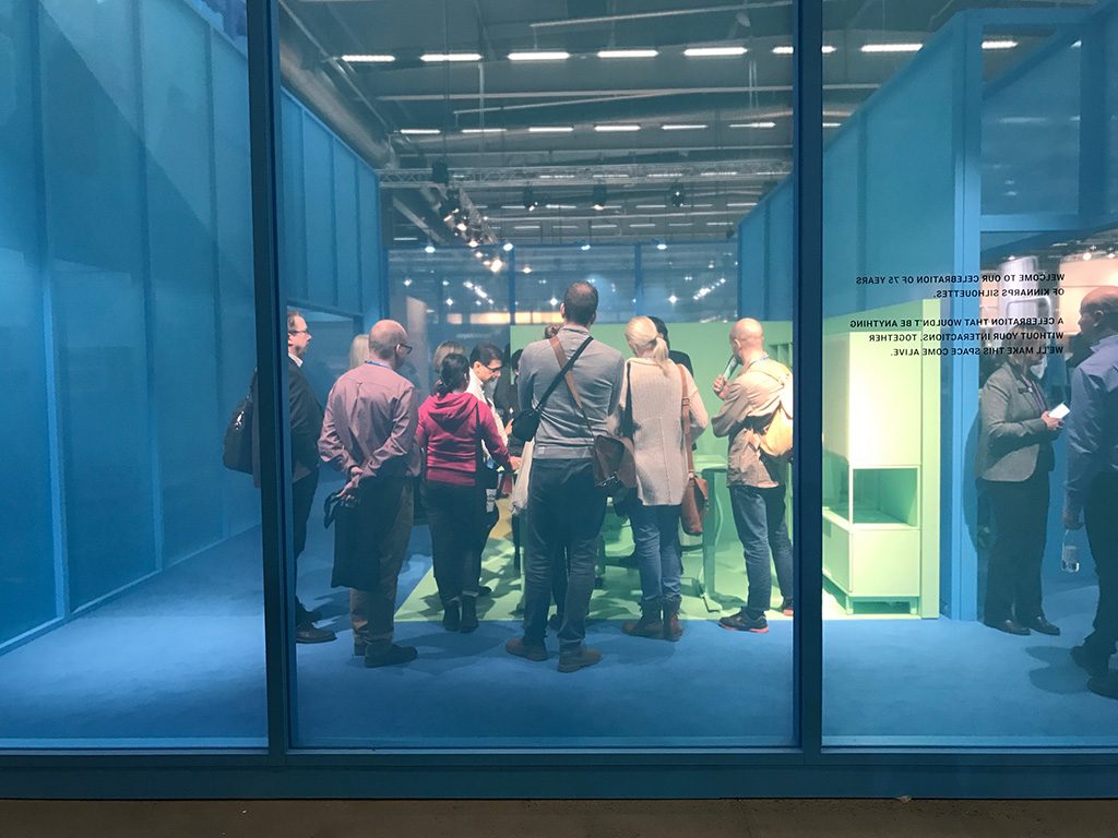
Seeing people interact with the products through the walls draws people inside.
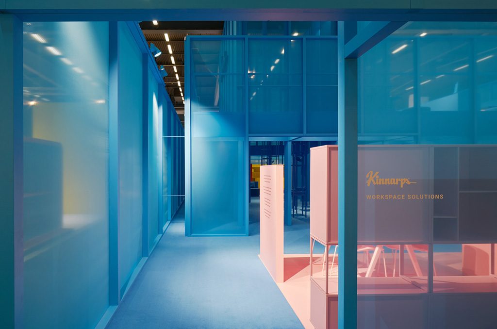
The semitransparent construction. Photo by Åke E:son Lindman
It became the conversation starter we had hoped for
As the fair started the Kinnarps stand quickly became what we had hoped for – A conversation starter, the talk of the town and a great ambassador for this fantastic brand started 75 years ago in the small village of Kinnarp by the entrepreneurs Evy and Jarl.
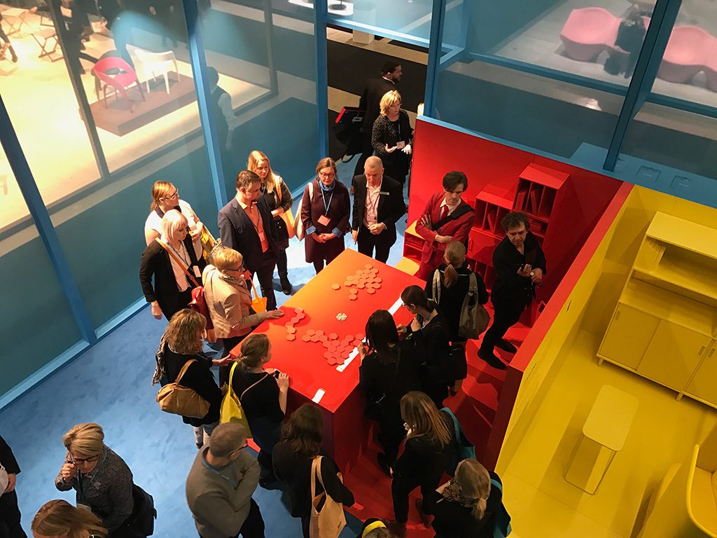
People interacting with the Kinnarps brand.
We set out to create a conversation starter and a conversation starter it became. People tagged more photos from the Kinnarps stand than ever before. We more than doubled the visitors from the year before and set new records every day.
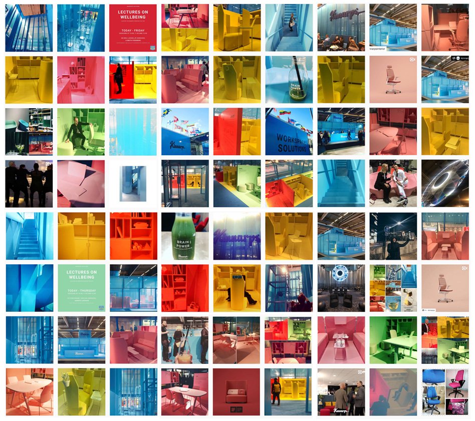
The stand was spread through social media more than ever before.
Awarded or the winner of the best stand at the Stockholm Furniture & Light Fair 2017
The recognition and ultimately the crowning of our work for Kinnarps happened during the second day of the fair. We learned that the Kinnarps stand was nominated together with three other stands for the The Stockholm Furniture & Light Fair 2017 Editor’s Choice Awards 2017.
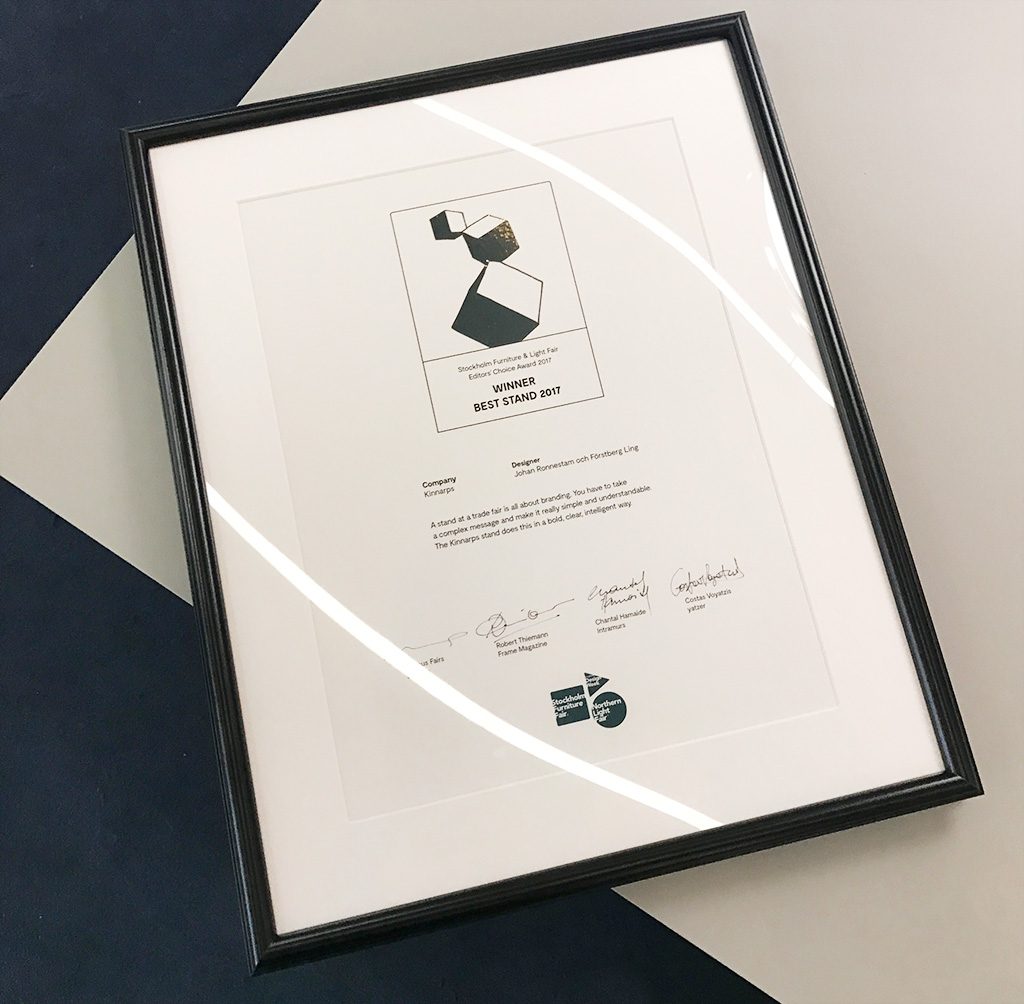
The 2017 Editor’s award for best stand at the Stockholm Furniture & Light Fair.
The competition was tough. The stands by &Tradition, Hay and Flos looked amazing and as we we’re waiting to learn who won the award I didn’t have any idea who would win. Personally I loved the &Tradition stand that in some sense was the total opposite to the Kinnarps stand. But in the end we came out as winners. The jury of the Editor’s Choice Award, Marcus Fairs from Dezeen, Costas Voyatzis from Yatzer, Chantal Hamaide from Intramuros and Robert Thiemann from Frame Magazine decided to award the Kinnarps stand. The motivation:
“A stand at a trade is all about branding. You have to take a complex message and make it really simple and understandable. The Kinnarps stand does this in a bold, clear and intelligent way”.
– The Jury of the Editor’s Choice Award.
This was spot on what I’ve been telling Kinnarps all through the project. We need to be the talk of the town yet on brand.
As we were invited up on stage to receive the award several members of the founding family were present. This was a great honor. To create things that stands out requires a delicate balance between listening to your client while not letting go of your visions.
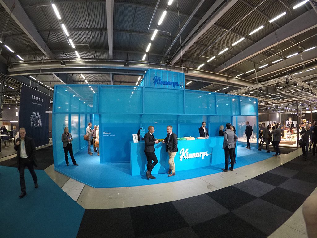
The final result. A strong architectual brand experience that became the talk of the town.
Thank you!
A lot of people have been involved in this project, but part from Förstberg Ling, I’d especially would like to thank Elisabeth Slunge and Ida Hermansson at Kinnarps global range and marketing for believing and supporting me in this project.
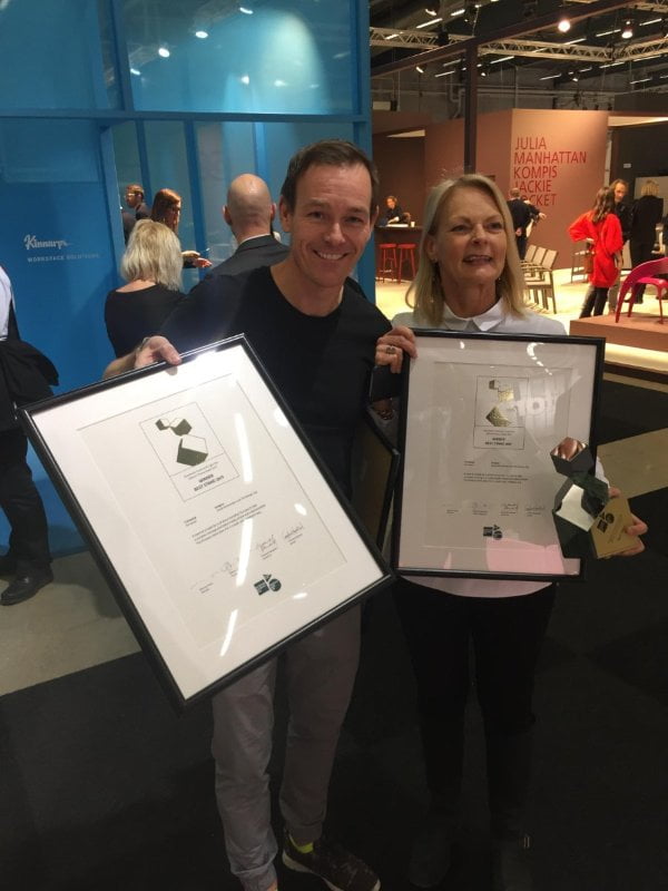
Me and Elisabeth Slunge from Kinnarps accepting the award.
Working with me can be rewarding but not always easy. Without my project manager Caroline Karlström and the project managers at Kinnarps, Erika Lundgren and Åsa Karlsson there wouldn’t be any stand at all. There’s a lot of people I’d like to thank obviously but my final shout out goes to the extremely talented crew at ‘Kinnarps Custom Design’ that have realised our ideas about the monochrome product stands. They’ve done an amazing job and proven nothing is impossible. It couldn’t be done without you!
Surf’s up!
