Sometime last year I was approached by Vasakronan, Swedens largest property brand with a property portfolio valued at SEK 80.3 billion. Being a market leader the felt their digital presence had to reflect that position. Their question: What do we do? As always I teamed up with Caroline Karlström and accepted the challenge to answer that question. In this project I took on the role as both head of strategy and concept as well as actually delivering the top level designs of the new Vasakronan that Britny later implemented and refined.
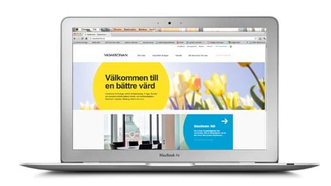
This is what we did. Parts of the new Vasakronan digital brand presence
The new Vasakronan.se runs WordPress!
Me and Caroline started the project with an analysis phase and analysed their existing presence, the traffic to their site, the content, the design and the site structure. We interviewed representatives from Vasakronan as well as their clients and potential prospects. We also performed an extensive technical analysis of their technical platform. Their brand presence online was running on Episerver, one of Swedens most common content management platforms and the front end was about three years old. It was classical site with tons of sections and also some flash content.
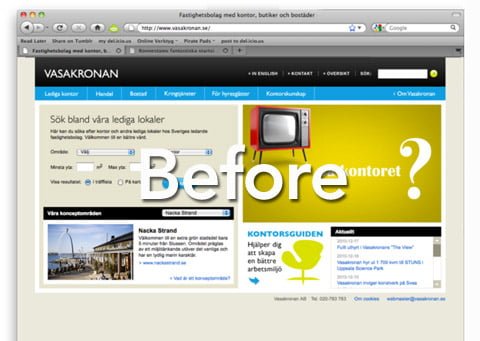
The old Vasakronan.se site.
On top of that the site was connected to their back end, partly built on Sharepoint. Already from start I felt that there was no need for this complex set up. If you also include the fact that Vasakronan intended to lead – not follow, then I also thought we needed to look at modern platforms such as WordPress.
Once we’ve passed the analysis phase, it was clear that there really was no need to run Vasakronan off Episerver. Instead we decided to give WordPress a try. WordPress would, beside the fact that the platform is free, give Vasakronan the ability to adapt to the world outside, fast! WordPress has got some 20000 developers devoted to making sure the platform is up to date. Future branding is all about making sure you stay on top technology instead of being dictated by technology due to the fact that you’re stuck in a slow developed platform. Vasakronans ambition moving forward is also to be a part of that community, meaning develop new plugins and functionalities that other brands can make good use of.
A new brand plattform needed to be digitalized.
Part from the fact that Vasakronan’s digital presence was a couple of years old another important fact was also that they we’re redesigning their brand language. Not their logo – but their tone of voice, their graphical expressions, colors and how they worked with images. This was a challenge.
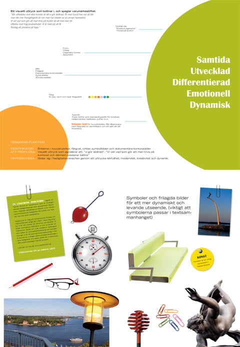
Parts of the Vasakronan brand manual that we had to digitalize.
Their new brand language was classical yet bold, however it was clearly developed to be used offline. I’m personally a big fan of simplicity and there was something in that brand presentation we were handed that struck a chord inside me.
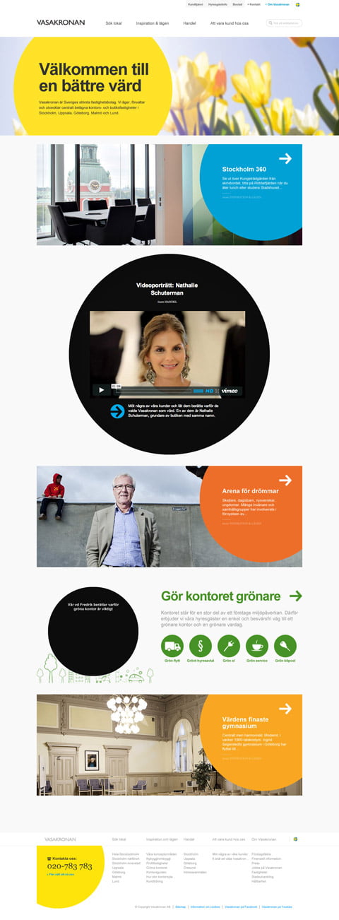
The new Vasakronan.se – on brand!
The challenge to bring this stuff online was something that made me smile. After some tweaking back and fourth I felt that I had nailed the graphical concept quite well. It was fresh, clean, usable and on brand.
Great content and simplicity is the new black.
Until now Vasakronan had been working quite a lot with SEM activities. However, their SEO presence was nothing to brag about. In order for this to change I developed a concept that was based on how blogs work. Basically, the content bloggers pushed ends up further down the site structure as more content is being pushed.
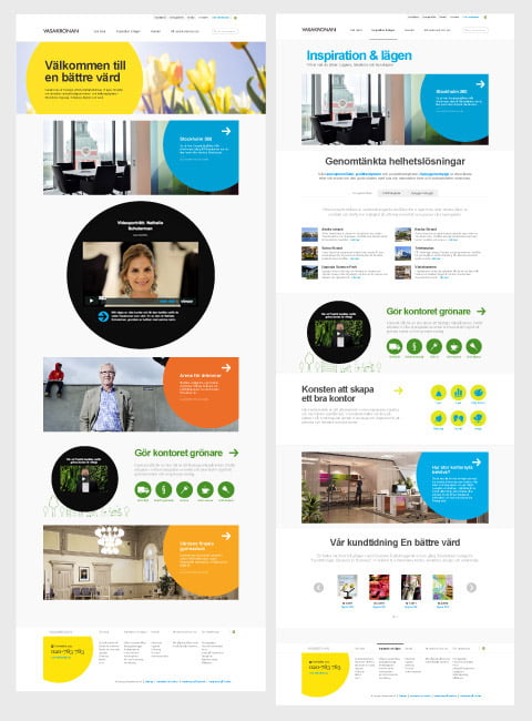
An example of how content from the first page is being pushed down in other sections
Considering the website analytic part of the project pointed in the direction few, if any visitors, were interesting surfing the Vasakronan website, instead people landed on one page, clicked one or two pages to get what they were there for and then left, I felt we needed to simplify everything – the site structure, the navigation, the amount of pages and way you search for new properties and of course also the design.
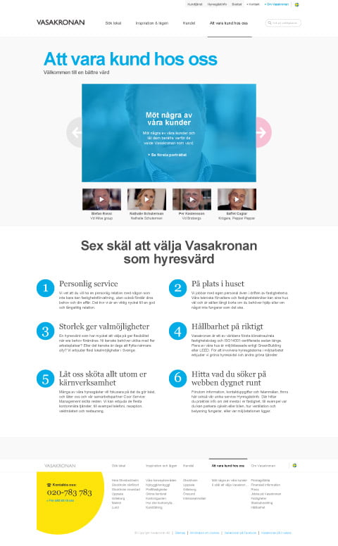
Simplicity was something we kept on striving for all through the project
Yet we also needed people to actually find Vasakronan. There’s of course tons of traffic ending up on Vasakronan via typed url’s or a search for Vasakronan. But there’s also a huge potential in attracting people through generic search. In order to establish a broader and better presence on Google we decided to make better use of Vasakronan’s customer magasine ‘En bättre värd’ (A better host).
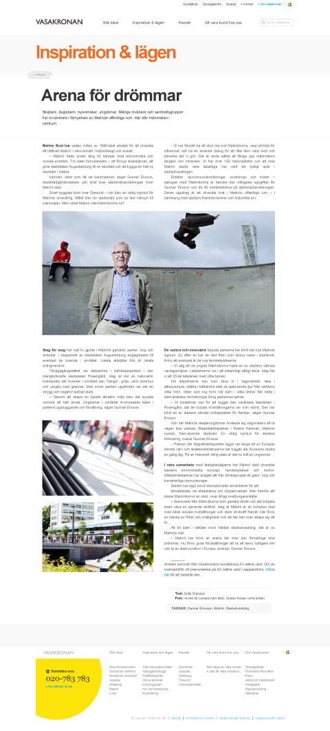
Making sure content is spread over multiple platforms to do good for the brand.
On the old site this magazine was published once a month as a PDF. Fine, the PDF attracts Google spiders too – but the content is not very readable online. This magazine was packed with quality content that will do a great job when the spiders comes crawling. Said and done. We established a section called Inspiration & lägen (Inspiration and locations) where the magazine is now portioned in smaller bits over time – just like a blogger would publish it.
iPhone and iPads. What should you do?
If you ask around I think most agencies out there will tell you that you must have a site for mobiles and one for iPads and other tables. I beg to differ. My point of view is that the visitors you have will visit your brand from different devices but that doesn’t mean they’re interested in learning new ways to navigate depending on which device they use today.
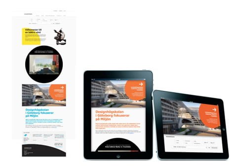
People should not have to learn new navigations from one device to another.
This is why I, when I started to design the site, aimed to create a design that would work on your desktop computer, your laptop, iPad and ultimately the smartphone of your choice. Of course it’s important to make sure you’ve thought about mobile sites and apps too. I don’t think there’s ever a need for a specific app or mobile interface to browse the generic content on Vasakronan.se if it’s built and designed right.
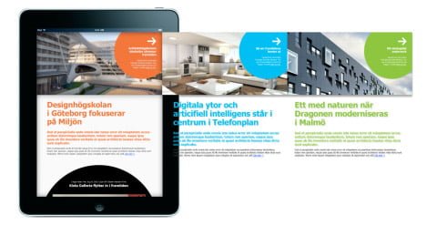
Trying out how content could be swiped in potential future apps.
However I definitely think there’s a need for apps that gives landlords, tennants and other target groups the ultimate way to access information and nurture their relation with vasakronan. For these needs we of course designed extra proof of concepts to make sure we didn’t launch anything that could not be developed further.
Now it’s time to put the concept into action – we need more pro’s!
Brands like Vasakronan hire me to make change happen. My assignment usually includes a strategy phase, a concept phase and a visualisation phase. With a set of different tools such as strategic and technical analysis, problem definition, conceptual and creative develoment and prototyping I help brands, in this case Vasakronan, to establish a communication platform. It’s extremely important to deliver the conceptual and creative concepts without having to think about your own organisation – this is why I do not recommend having an agency that delivers both the concept and the implementation – it usually ends up being something that agency makes money off suggestion.
In this case me and Caroline together with different freelancers delivered a concept that focused on creating the best possible solution online for Vasakronan – now it was time to find the best fitted consultant that could take our concept and implement it. In order to find that consultant we, together with Vasakronan, selected five agencies. After having heard the agencies present themselves we also asked them to present how they were to implement the concept we had delivered for Vasakronan. Britny, Swedish kick ass web agency that I’d been working with before, delivered a fantastic presentation. It was clear that both their creative department and technical department understood why we’d chosen the solutions we had and how we intended them to be implemented.
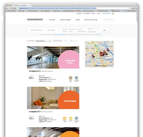
The listing of properties – the concept brought all the way by Britny
Said and done – Britny and Vasakronan came to an agreement and they started working on the implementation of our project. From our side Caroline left the project and I stayed on board to secure that the concept we’d delivered would be treated right. It was also important to make sure the kept to our technical strategy when using WordPress as the content management system. We’d built in tons of strategical and graphical executions that only made sense if you’d built them into WordPress the right way. The team at Britny did a fantastic job when taking our concept further. They treated it with great care. I especially found it rewarding that their lead designer, Daniel Stridsberg and head of tech Fillip Wastman, embraced the design platform I had initiated and nurtured it well. Except for Daniel and Fillip the team consisted of Iyob Mesfin, Jonas Rogert and Jonas Eriksson all equally important.
The result?
Vasakronan has managed to revamp their online presence in a magnificant way. The new site is easier to use, we’ve taken away all second level menues we’ve could, the design is on brand and may I say so – ground braking in terms of sitting on top of a content management system, it’s like nothing else and differentiates Vasakronan from their competition and it works like a charm on any platform. Knowing what they’re up to behind the scenes I’m proud to say this is one of the projects I’m most pleased with during 2011! But then again – that’s what I think 😉
Thank you Britny for sticking to our guns. Thank you Vasakronan for daring to be different!
Rock on!