Category: Usability
-

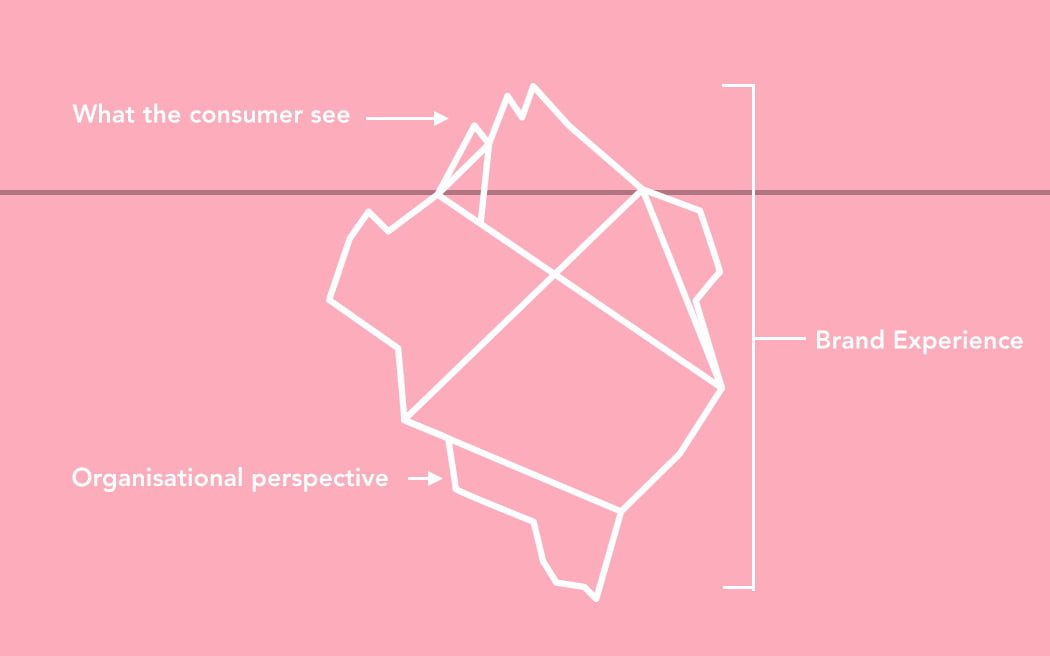
Future brands are like icebergs
We all know how what an iceberg looks like. As you approach it it looks fairly small, it’s easy to get an idea of the size, the shape and dimensions of it. However, we all know that underneath that surface the total mass of the iceberg is hidden. In fact 7/8 of the iceberg is hidden…
-
Dear Saab. Your Site Sucks
Usually when I don’t like something I try to give constructive feedback. But in this case there’s just to much of a history involved. About 9 years ago I tried to pitch ideas on Saab. Partly because I really wanted to work with a car brand and partly because they were Swedes. Already back then…
-
The Social Formula For Small Business Owners
About two years ago I frantically started writing on this blog post. Then the sheer length of it got the best of me and since then it’s been stuck in my unpublished library. Now I thought it’s time to give birth to this baby even though most of it was written about two years ago,…
-
What Does The New York Times Know That We Don't?
A couple of hours ago the New York Times launched an update of the skimmer interface I wrote about earlier this year. It’s an alternative way to browser their online magazine. They call it The Times Skimmer. The new interface let’s you navigate between different sections of their paper by only using the arrows on…
-
Logistics innovated with Augmented Reality
United States Postal Service has launched this augmented reality application that allows their customers to find out if a certain shipment fits the box and thereby also finding out what it actually costs. It’s smart, it’s branding and it’s innovation! SwissMiss got me hooked up.
-
More than 80% use Google instead of the actual URL when visiting a brand website.
In order words. You sure as hell wanna make sure that brand of yours is found among the top searches on Google. SEO is more important than ever. Building websites that get listed and linked up is key. So, if you wanna get our management team on board, do the following 3 steps: Print this…
-
First came the voice, then came the finger and now comes the voice again
Aha. So you’re still at home crying about that car you drove of the bridge while texting ‘Look, I can drive without holding the steering wheel’. Well, not to worry. Vlingo has got just the thing for you. These guys have launched an application that allows mobile phone users to speak and look-up information such…
-
Blog of Ronnestam on iPhone
If you got an iPhone. If you every now and then visit Ronnestam.com. Then you’re in for a new experience optimized for your phone. Thanks to the excellent plugin WPTouch I’ve made sure the site loads faster, is easier to use and renders better on iPhone. Now you know.
-
The 10 commandments of webdesign
Business Week posted a great article on the 10 commandments of webdesign. The list is short but well thought thru. Thou shalt not abuse Flash. Thou shalt not hide content. Thou shalt not clutter. Thou shalt not overuse glassy reflections. Thou shalt not name your Web 2.0 company with an unnecessary surplus or dearth of…
-
Corporate blogging could be a low-cost, high return marketing tool
More and more companies out there spend more time blogging and less money on traditional advertising. Blogging can potentially be the perfect marketing tool for a small business IF you know how to handle it. MarketingVOX has a post for you people out there who want to know more. The post gives 10 tips. 1.…
-
The art of signing people up
Tim Bednar at Turtle Interactive has written one of the most valuable posts/articles I’ve ever seen about signing people up. Tim has reviewed the sign up design and functionality of Freshbooks, Backpack, Dropsend, Vyew, Blinksale, Remember the Milk, Scrapblog, Crazy Egg, 30boxes, Blogger, del.icio.us, Flock, Give Meaning, Kiko, My Pick List, Titlez, CRM from Zoho,…