The other day a friend of mine brought H&M’s global website to my attention again. Back in 2006 I was one of their consultants until I more or less lost the assignment due to the fact that I told them what the didn’t wanna hear – Your website sucks! Of course I was wrong and they were right. After all, they’ve been awarded time after time at major advertising shows (Thanks to among others to me and the team I worked with back then) so why wouldn’t they know what they are doing.
This is exactly where the problem start for most major brands – at ad awards like Cannes Lions, Eurobest, Clio and others where people with no understanding for how to build an online presence beyond Adobe Flash and cool animations take these monsters to new heights. Back in 2007 I was also a part of building these kind of platforms for major brands but behind closed doors I constantly tried to convince my clients that sticking to these worn out technologies was nothing but stupid.
Let’s take a look at couple of major players and have a quick look at their online presence.
The Online Nike Store
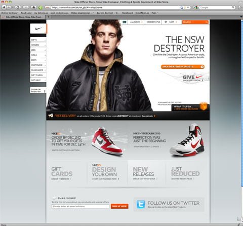
The online store belonging to the worlds leading sports brand. All built in Flash…in 2010
Nike has always been among the first brands to adapt to change. Back in 1999 when I took part in pitching them into Framfab they were even heading the pack.
At first glance it all looks great. The site design is inspired by blogging with that clear and present left hand menu hanging there. But once you start looking deeper it’s a mess. The entire store is built in flash which is just plain stupid. To Nike’s defense I’ll ad that they launched the store in this costume around 2005 when Flash was the hottest thing around. However that’s not the case…since 3 years back. Until a couple of month ago the first page on Nike.com was also dressed in Flash but now they’ve changed that.
Nike.com is filled with fantastic content that people would love to get their hands on. Take Nike+ as an example, a fantastic running community that would have been spread engaged people hundred times more if they’ve built an open platform that allowed the community to truly contribute. However, today the Nike+ site like most of the other sites is locked up deep down in custom made solutions that doesn’t make it easy for people to speed the brand.
The adidas digital presence
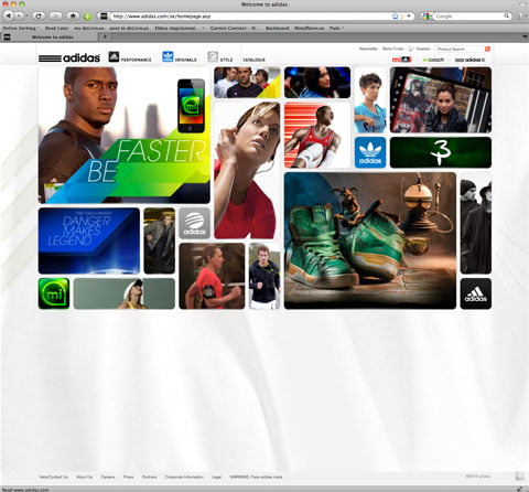
As you might know I was working with adidas for a full 8 years. During those years I Creative Directed and took part in launching 59 global digital advertising campaigns for the brand. I also took part in developing their global site and their intranet.
In 2006 we launched the adidas global campaign for the World Cup held in Germany. Around this time I started to raise the question about leaving the flash platform. All results pointed in the direction that Flash, that was and is a wonderful platform when it comes to creating cool rich media sites, didn’t meet any of the demands that the users had. People came looking for products, videos, TVC’s, exclusives and more – but they did not want was to load heavy content, use unique navigation, not being able to bookmark specific pages or share specific content with their friends.
I continued to work with adidas until 2008 but never managed to convince them to leave the flash platform. Instead they listened to another agency that managed to talk them into rebuilding their global website with flash as the main tool. In 2008 they launched the new adidas.com, the same site you’ll see today and it was already in 2008 a step backwards, today it’s more of an artifact that they instead should burn on a disc and give away to Wikimedia as an historic time stamp.
The Rolex Global Brand Site
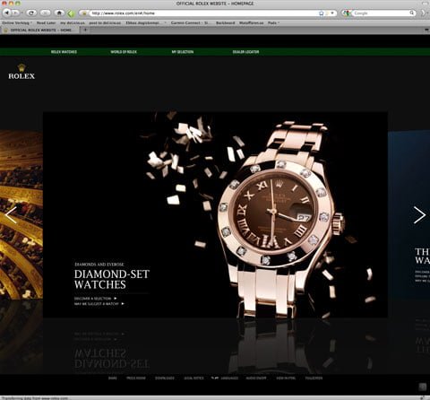
The Rolex site. I full on Flash site that demands a state of the art computer and broadband connection
Oh god how I loved this full-screen flash site when it was launched in 2007. It was state of the art and even though I started to abandon working with flash sites at the time I still felt that this served Rolex purpose. Now 3 years later I’m on the contrary sure it serves no purpose at all.
The thing with these sites made entirely in flash is the fact that they don’t do anything that cannot be done in HTML and frankly they can’t do some of things you can in HTML 5. The most important thing though is that when you build things in flash you’ve gotta cater for the SEO/SEM manually by customizing the platform.
A Car Site – Volkswagen
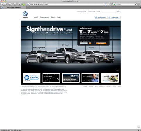
Volkswagen has since 2007 been going with flash all over the place. It was a bad decision then and still is.
I just took Volkswagen as an example. Every car brand seems lost in flash and big ass animations when you visit the campaign sites. Kind of strange since all we want is tons of short videos and photos of the cars. After all, we’re supposed to make a decision to buy a 50000$ car based on this information…
The Global H&M Site

The global H&M site all built in flash back in 2006. It takes you 4 minutes on an ok connection to even reach the right information.
I don’t even know where to start. It’s just plain stupid. The H&M site uses flash but in a way so that it could all have been built on HTML4 technology. There’s simply no logical reason at all why this site should work like this. I took part in launching Viktor & Rolf in 2006, Kylie in 2007, Summer of Surf and more for H&M years ago. Back then we had discussions where I told H&M they should throw the entire platform out and get new technology in. That was of course not appreciated and as we ended up being forced into creating flash sites we decided to drop H&M as a client in 2008.
The Microsoft Web Site
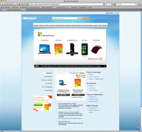
These guys got their first page covered in an animated Silverlight banner even thought they announced the wouldn’t continue develop this platform. Say no more… (Updated, just before I was about to press the publish button they actually removed the Silverlight technology from the first page)
Microsoft are strange. They more or less have the same site they had back in 2001 or something. They’re stuck with Verdana and a monster of a site. I bet that somewhere in that big ass company there’s a manager responsible for the site saying things like “It’s just to much information, we just cannot change this site” I say 85% of it is shit. Throw the site away and start off fresh!
So, why does’nt worlds best brands get online communication right? There are of course lots of reasons but I want to share 5 thoughts on the subject.
Old management
This is of course the number one problem. The guys and girls that are running these brands have in most cases been brought up in their business life before the Internet existed. This means they’ve learned how the world of communication works without the now most important component – The Internet. Having these people lead your brand Is like hiring an architect that doesn’t know 3D or CAD. They simply don’t know better.
The Ad Award problem
So, most of the people who manage these brands most likely send their stuff to ad awards. And most ad awards juries in the world are filled with advertising people who don’t give a damn about results. They go for the four F. Flash, Fun, Friends and Finalists. This means Flash as in sound and cool animations that more or less looks like the TVC the jury people love to see. Fun as in games, crazy solutions and humor. Friends as in awarding agencies and foremost people they know from start. Finally finalists as in – if another award show awarded the contribution, something must be right.
Stuck in technology
Most major brands have invested in huge content management systems. Interwoven, Sharepoint, SDL, Polypoly and Episerver among others. These systems were built by consultants aiming to lock you in and they were built for old web thinking. Many editors and many pages. Now when suddenly you wanna change technology or change how your digital presence is built up, these brands have to change their strategy entirely. This turns IT managers and brand managers into people afraid of change since that would mean they threw 1 million Euro on something useless. Thinking like that is of course wrong since were living in uncertain times where you don’t have a clue what’s right or wrong in 3 years apart from the fact that you will probably be wrong. Sticking to open source products and constantly iterating your online presence is the solution.
Wrong consultants
Most web agencies and advertising agencies out there have staffed their companies with people who can do wonders with Flash and .Net based platforms. Then suddenly you’re supposed to have people on your team who can rock PHP, MySql, Ruby, Python, Cassandra, Java, Jquery and other technologies that most IT departments hate on top of that.
Brand managers not understanding technology
Some of you will think I’m plain stupid. A brand manager shouldn’t need to understand technology. But I have different opinion. Personally I’d always prioritize knowledge about technology over knowledge about brands since all brand will be built on technology in the future and the wrong decisions from a digital point of view will have a greater negative impact on the brand compared to non technical decisions. After all, the world is filled with consultants who really know traditional branding while the other breed is hard to find.
Last but not least – CEO’s that just doesnt get it.
I’ve written a long post about these dinosaurs before. Go read it ››
So, if you’re heading a brand or a company. Here are 7 things you should do asap to get your brand moving into the digital future.
1. Never let an advertising agency steer how you do digital communication
Always initiate projects with the digital communication aspects first. It’s not very hard for offline activities to support online when they’re planned. The other way around thought is practically impossible.
2. Leave Flash. Leave Silverlight.
From a user point of view (based on how people really use the Internet) the is nothing, absolutely nothing, that motives the use of these technologies.
3. Change platform from your propriety platform.
The sooner you move all your digital assets to open sourced and MySql based ones such as WordPress, Drupal or others, the better!
4. Make sure you socially integrate the spreading of your content on most major social platforms.
Start by checking up on Brian Solis and JESS3 Conversation Prism. Video, Sound, Events, Documents, Live Streaming, Podcast, Images, Social Networks, Intranets, Extranets, CRM. It’s all to be found there as I wrote about the other day.
5. Provide people with true values
Once people end up on your site they are there for the products. They don’t wanna play around with games and shit. Products and services, that’s what you sell. If they’ve found you, your advertising has done the job – start selling!
6. Search should steer everything you do
Face it. People Google everything so make sure your platform is built to lure the Google robots into bed.
7. Don’t fear loosing your job.
Only fear doing things that doesn’t do any good for your brand. That will most surely get you a new one of you have one of those dinosaur bosses!
Go change now!